
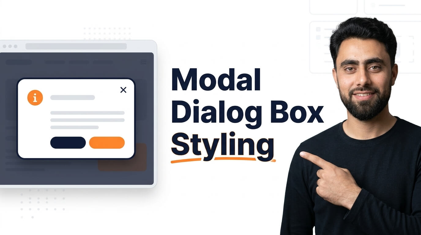
Get the code of Modal Dialog Box Styling and watch video tutorials. You can practice using our code editor. Our practical guide will make your learning journey much easier. You can explore the tutorial and learn.
<dialog open>
  <h1>Approve Access</h1>
  <form method="dialog">
    <button>Cancel</button>
  </form>
</dialog>
dialog {
border-radius: 5px;
}
dialog button {
border: none;
background: red;
color: white;
padding: 5px 20px;
}Modal Dialog Box Styling with CSS
A modal dialog box is a useful element in modern web design that allows websites to display important information without sending users to another page. It usually appears in the center of the screen while the rest of the webpage becomes darker or less prominent. Modal dialog boxes are commonly used for login forms, confirmation messages, image previews, registration forms, and important notifications.
With CSS, you can customize the appearance of a modal dialog box to match your website’s design. A well-designed modal should look attractive, display information clearly, and provide an easy way for visitors to close it.
What Is a Modal Dialog Box?
A modal dialog box is a window that appears above the main content of a webpage. In many designs, users must interact with the modal or close it before continuing to use the underlying page.
Unlike a regular section of a website, a modal attracts attention by separating its content from the background. For example, an online store might display a confirmation dialog before a customer removes a product from their shopping cart.
Why Is Modal Dialog Styling Important?
CSS styling helps make modal dialog boxes more professional, readable, and user-friendly. Without proper styling, a modal can appear confusing or difficult to use.
Here are some important benefits of styling a modal dialog box:
- Better appearance: Rounded corners, balanced spacing, and subtle shadows create a polished design.
- Improved readability: Appropriate font sizes, text colors, and line spacing make the message easier to understand.
- Clear visual focus: A semi-transparent background overlay helps users concentrate on the modal content.
- Easy interaction: Clearly visible buttons and a close icon help visitors understand what to do next.
- Consistent design: Matching the modal to your website’s colors and typography creates a more unified experience.
Important CSS Properties for Modal Dialog Styling
Several CSS properties are useful when designing a modal dialog box.
1. Background Color
The background color separates the modal from the webpage. White or light gray is often suitable for the dialog itself, while a dark, semi-transparent overlay can make the background content less distracting.
2. Border Radius
The border-radius property creates rounded corners. A small radius gives the modal a modern appearance without making it look overly decorative.
3. Box Shadow
The box-shadow property adds depth and helps the dialog stand out from the surrounding content. A soft shadow is usually more attractive than a very dark or sharp one.
4. Padding and Width
Padding creates space between the modal’s content and its edges. The width should provide enough room for the message while remaining comfortable on smaller screens.
5. Typography
Readable fonts, suitable text sizes, and good color contrast improve the overall user experience. Important headings should be easy to distinguish from supporting text.
6. Transitions and Animations
CSS transitions and animations can make a modal appear more smoothly. A subtle fade-in or slight movement can improve the visual experience, but excessive animation may distract users.
Tips for Creating a Professional Modal
When styling a modal dialog box, keep the design simple and functional. Use a clear heading, a short message, and buttons with descriptive labels. Make sure the close button is easy to find and large enough to use comfortably.
Responsive design is equally important. The modal should fit smaller screens without extending beyond the viewport. Using a flexible width and appropriate maximum width can help maintain a consistent appearance across devices.
Accessibility should also be considered. Text needs sufficient contrast, keyboard users should be able to navigate the dialog, and focus should remain within an active modal when appropriate. Users should also have a clear way to close it, including through the keyboard when supported.
Remember that CSS controls the modal’s visual appearance, but its opening, closing, and interaction behavior require appropriate HTML and JavaScript or a suitable native HTML dialog implementation.
Common Mistakes to Avoid
One common mistake is making a modal too large, leaving little space for the webpage around it. Another is using low-contrast text, which makes important information difficult to read.
Avoid excessive shadows, unnecessary animations, and too many buttons. Also, do not rely exclusively on a small close icon if users may need another clear way to dismiss the dialog.
Conclusion
Modal dialog box styling is an important part of creating a modern and user-friendly website. By using suitable background colors, rounded corners, subtle shadows, readable typography, and responsive layouts, you can create dialogs that look professional and communicate information effectively.
Whether you are designing a confirmation message, login window, or notification, focus on clarity, accessibility, and ease of use. A thoughtfully styled modal dialog box can improve the overall appearance of your website while helping visitors complete important actions with confidence.
Ready to become a better coder? Don’t miss this tutorial! How to add Animation delay in CSS