
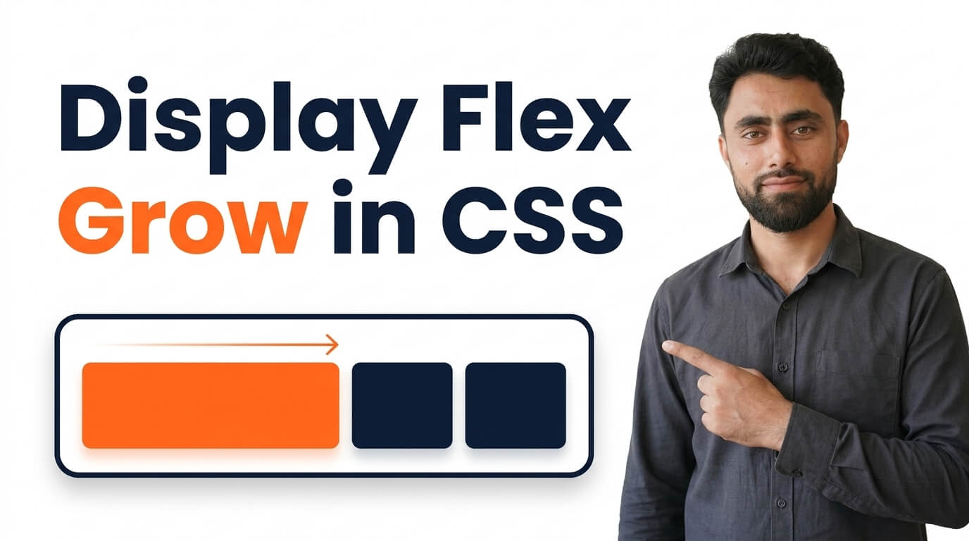
Display Flex Grow in CSS
Get the code of Display Flex Grow in CSS and watch video tutorials. You can practice using our code editor. Our practical guide will make your learning journey much easier. You can explore the tutorial and learn.
<div class="container">
  <div>1</div>
  <div>2</div>
  <div>3</div>
</div>
.container {
display: flex;
background: dodgerblue;
}
.container div {
background: white;
padding: 10px;
margin: 5px;
flex-grow: 1;
text-align: center;
}Display Flex Grow in CSS
CSS Flexbox makes it easier to create flexible layouts that adjust to different screen sizes and available space. One of its most useful properties is flex-grow, which allows a flex item to expand and take up additional space inside its container.
When designing a website, you may want one element to occupy more space than another without setting fixed widths for every item. The flex-grow property helps achieve this by distributing available space among flex items according to their growth values.
Understanding how flex-grow works can help you build responsive navigation bars, content sections, dashboards, and other modern website layouts.
What Is Flex Grow in CSS?
The flex-grow property determines how much a flex item can grow relative to other flexible items when extra space is available in the container.
By default, flex items have a flex-grow value of 0. This means they do not grow to fill the remaining space simply because that space is available.
When you give an item a positive value, such as 1, it can expand to use a share of the available free space. If several items have different growth values, the browser distributes that space proportionally.
For example, an item with flex-grow: 2 receives twice as much of the available free space as an item with flex-grow: 1, assuming both items can grow without other sizing constraints affecting the result.
How Does Flex Grow Work?
To understand flex-grow, it helps to know that it works inside a Flexbox container. The parent element must use a layout mode that makes its children flex items.
Once the container is established, the browser considers the available space along the main axis. In a standard row layout, this is the horizontal direction. In a column layout, it is the vertical direction.
The browser then distributes positive free space among items according to their growth factors, while also considering their base sizes and other layout constraints.
It is important to remember that flex-grow does not automatically make an element fill the entire container in every situation. Its behavior depends on how much free space exists, the sizes of the other items, and any relevant minimum or maximum size restrictions.
Understanding Flex Grow Values
The value assigned to flex-grow determines an item’s share of the available extra space.
flex-grow: 0— The item does not grow to absorb extra space.flex-grow: 1— The item participates in sharing available extra space.flex-grow: 2— The item receives twice the growth share of an item with a value of1, when the same available space is distributed proportionally.- Higher positive values — The item receives a larger proportional share compared with items that have smaller growth factors.
These values are not fixed widths or percentages. A growth value of 2 does not mean the item will always become twice as wide as another item. The final size also depends on the initial sizes of the items and the amount of free space in the container.
Why Is Flex Grow Useful?
The main advantage of flex-grow is that it helps create layouts that adapt naturally to the available space. Instead of manually calculating widths, you can let the browser distribute extra room between elements.
Here are some common uses:
Responsive navigation bars: A navigation item or search area can expand while other controls maintain their natural sizes.
Content layouts: A main content section can take up the remaining space beside a sidebar.
Dashboard interfaces: Different panels can share extra room according to their importance.
Website headers: Flexible areas can expand between a logo and navigation controls.
Application interfaces: Toolbars and content panels can adapt when the browser window changes size.
This flexibility can reduce the need for unnecessary fixed dimensions and make layouts easier to maintain.
The Difference Between Flex Grow and Width
The width property specifies an element’s preferred width, while flex-grow controls how it participates in distributing extra space along the main axis.
A fixed width can be useful when an element needs a predictable size. However, layouts built entirely around fixed widths may become difficult to manage on smaller screens.
With flex-grow, an item can expand according to the space available. This makes it particularly useful when the amount of content or the browser window size may change.
The two approaches are not mutually exclusive. Flex items can have a defined basis or initial size and still grow when the layout has extra room.
Common Mistakes to Avoid
Although flex-grow is straightforward, beginners sometimes misunderstand how it affects element sizes.
Forgetting the Flexbox container: The property is designed for flex items, so the parent must establish an appropriate layout context.
Assuming the value represents a percentage: A growth value of 1 does not mean the item will occupy 100% of the container. It represents a proportional share of available free space.
Ignoring the other flex items: An element’s growth depends on the growth factors of the other items, not just its own value.
Expecting growth when no free space exists: If the container has no positive free space along the main axis, there may be nothing for the item to absorb.
Overlooking size constraints: Minimum sizes, maximum sizes, and content can influence how much an item actually grows.
Understanding these points makes it easier to identify and fix unexpected layout behavior.
Best Practices for Using Flex Grow
Use flex-grow when you want elements to share additional space dynamically rather than assigning every item a rigid width. Choose growth values based on the intended relationship between the items, and test the layout at different screen sizes.
It is also helpful to understand the related Flexbox properties. flex-shrink controls how items shrink when space is limited, while flex-basis establishes an item’s initial main size before free space is distributed. Together, these properties help determine how flexible an item is.
For more predictable layouts, consider whether the content can wrap, whether items need minimum widths, and whether certain elements should remain a consistent size.
Conclusion
The flex-grow property is an important part of CSS Flexbox because it allows elements to expand and share available space proportionally. It is useful for creating responsive navigation bars, content areas, dashboards, and many other flexible layouts.
By understanding growth values, available free space, and the relationship between flex-grow, flex-shrink, and flex-basis, you can create layouts that adapt more naturally to changing screen sizes. With practice, this property can make your CSS cleaner, more flexible, and easier to maintain.
Ready to become a better coder? Don’t miss this tutorial! Add Pagination using CSS