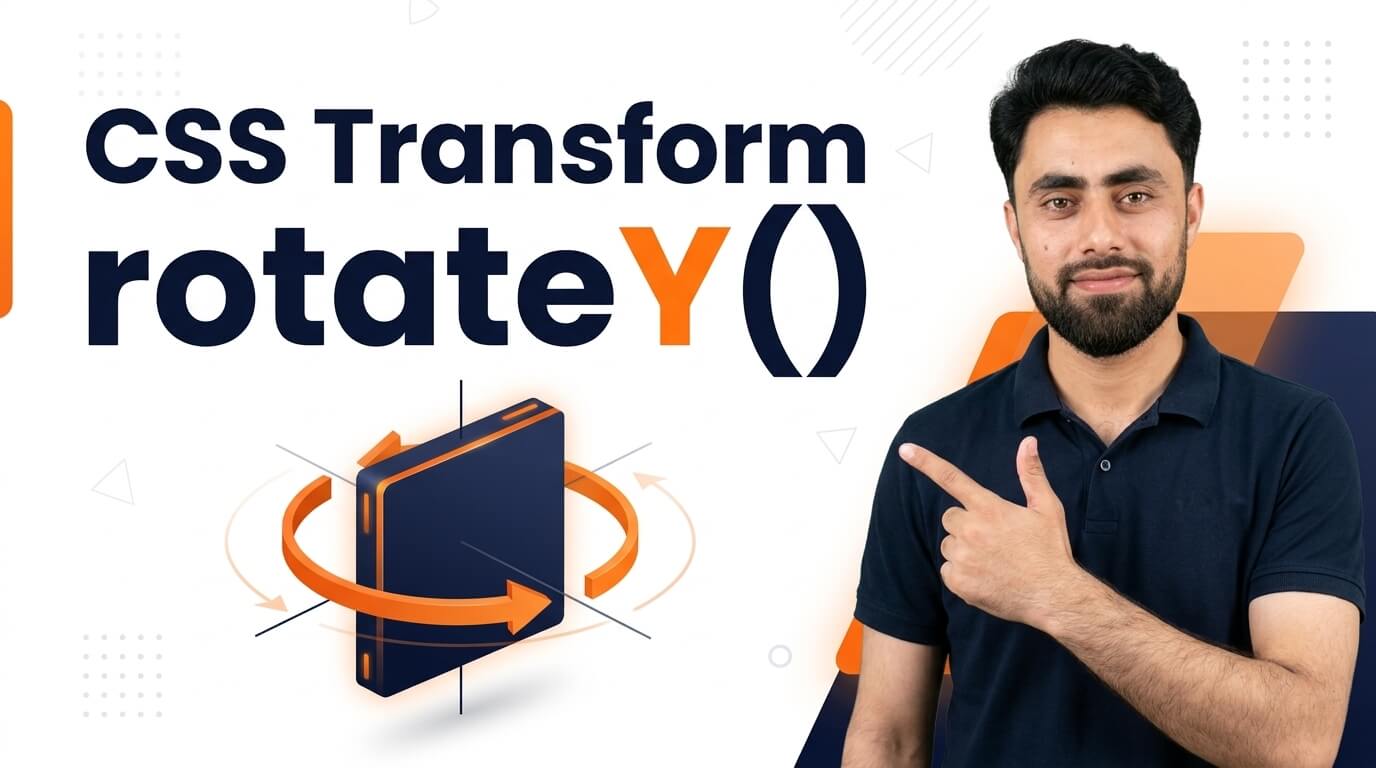
Here is a CSS Transform rotateY
Get the code of CSS Transform rotateY and watch video tutorials. You can practice using our code editor. Our practical guide will make your learning journey much easier. You can explore the tutorial and learn.
<div class="container">
  <div class="box"></div>
</div>
.container {
width: 200px;
height: 150px;
border: 3px solid black;
perspective: 600px;
}
.box {
background: red;
width: 100%;
height: 100%;
transform: rotateY(45deg);
}CSS Transform RotateY
CSS transforms allow developers to change how elements appear on a webpage without changing the normal document layout. One interesting transform function is rotateY(), which rotates an element around its vertical Y-axis. This effect is commonly used to create 3D card flips, animated images, interactive buttons, and modern website designs.
With CSS rotateY(), you can add depth and movement to a webpage while keeping the implementation lightweight and flexible.
What Is RotateY in CSS?
The rotateY() function is part of the CSS transform property. It rotates an element around its vertical axis, creating a three-dimensional turning effect.
Unlike rotateZ(), which rotates an element within the plane of the screen, rotateY() makes the element appear to turn sideways. As the rotation angle increases, the element may appear narrower because its surface turns away from the viewer.
The rotation angle is usually measured in degrees. For example, a small angle creates a subtle tilt, while a rotation of 180 degrees turns the element around to face the opposite direction.
How Does CSS RotateY Work?
The rotateY() function changes the visual orientation of an HTML element. It can be applied to images, cards, buttons, containers, and other elements.
Developers can use this function on its own or combine it with other CSS transform functions to create more complex effects. For example, combining rotation with scaling or translation can make an element appear to move and turn at the same time.
When used with CSS transitions, the rotation can happen smoothly as a user interacts with an element. This is especially useful for product cards and interactive components that reveal additional information.
Benefits of Using RotateY
3D visual effects: RotateY creates the appearance of depth by turning elements around a vertical axis.
Interactive card designs: It is often used to create cards that flip to reveal additional content.
Engaging animations: Images, icons, and other elements can rotate smoothly during user interactions.
Creative layouts: A subtle 3D rotation can add visual interest to product displays and promotional sections.
Lightweight styling: CSS can create these effects without requiring a separate animation library for simple interactions.
Common Uses of CSS RotateY
One popular application is the 3D flip card. A card can rotate to reveal information on its reverse side, making it useful for team profiles, educational flashcards, and feature displays.
Another application is product presentation. An image can rotate slightly when hovered over, giving an online store a more interactive appearance.
The effect can also be used in image galleries, navigation components, and animated website sections. However, it is best to use rotation where it supports the user experience rather than adding unnecessary movement.
Tips for Creating Better RotateY Effects
Start with a small rotation angle when creating subtle hover effects. Large rotations can make content difficult to read, especially when text rotates along with the element.
For more realistic 3D designs, CSS provides properties such as perspective, which influences how strongly depth is perceived. The transform-origin property can also change the point around which the element rotates.
If you are building a flip card, consider how its front and back faces should behave. Properties such as backface-visibility can help hide the reverse side of an element when it faces away from the viewer.
Use smooth transitions to make the movement feel natural, and test the design on mobile devices. Since touchscreens do not work like mouse hover interactions, important information should remain accessible without requiring a hover action.
Common Mistakes to Avoid
A common mistake is expecting rotateY() to behave like a flat, two-dimensional rotation. It rotates around the vertical axis, so the element’s apparent width changes as it turns.
Another mistake is forgetting to manage the front and back faces when creating a flip card. This can cause both sides to appear at the same time or display content in an unexpected way.
Developers should also avoid excessive rotation that makes text unreadable or creates unnecessary visual distractions. Accessibility and reduced-motion preferences should be considered when designing more complex animations.
Conclusion
CSS transform: rotateY() is a useful tool for creating three-dimensional turning effects on websites. It can make cards flip, images rotate, and interactive components feel more engaging.
By combining rotateY() with perspective, transitions, and appropriate backface styling, developers can build polished effects while keeping their designs responsive, accessible, and easy to use.
Want to level up your coding? Check out this tutorial, too: How to create videos slider section in shopify store?