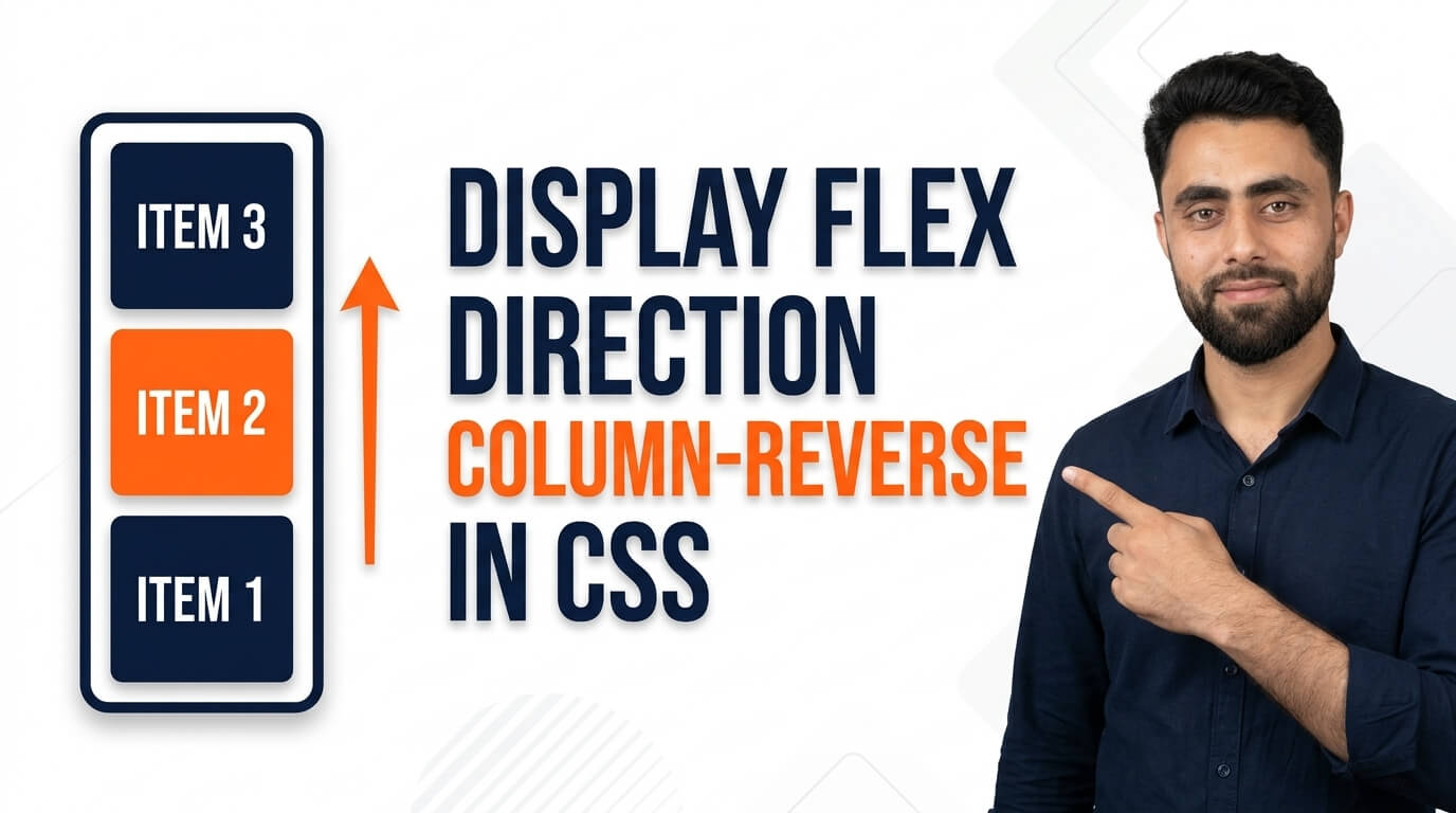
Here is a Display Flex Direction Column Reverse in CSS
Get the code of Display Flex Direction Column Reverse in CSS and watch video tutorials. You can practice using our code editor. Our practical guide will make your learning journey much easier. You can explore the tutorial and learn.
<div class="container">
  <div>1</div>
  <div>2</div>
  <div>3</div>
  <div>4</div>
</div>
.container {
background: dodgerblue;
display: flex;
flex-direction: column-reverse;
}
.container div {
background: white;
padding: 15px;
margin: 5px;
}Display Flex Direction Column Reverse in CSS
The CSS display: flex and flex-direction: column-reverse properties allow developers to arrange elements vertically in reverse order. Instead of displaying items from top to bottom in their normal sequence, this combination reverses the direction of the vertical layout.
Flexbox is a powerful CSS layout system that makes it easier to organize content, control spacing, and align elements on a webpage. The column-reverse direction can be useful for specific interface designs, notification lists, and other components where a reversed visual arrangement is required.
What Is Display Flex Direction Column Reverse?
The display: flex property turns an HTML element into a flex container, allowing its direct children to behave as flex items.
The flex-direction: column-reverse property arranges those items vertically in the opposite direction from a normal column.
For example, imagine a container with three items labeled A, B, and C. With the normal column direction, they appear from top to bottom as A, B, C. With column-reverse, their visual arrangement becomes C, B, A.
This changes the direction of the layout without requiring developers to reposition each element individually.
How Does Column Reverse Work?
To use column-reverse, the parent element must first be assigned display: flex. The direction can then be changed to column-reverse to reverse the vertical arrangement of its direct children.
Unlike a normal column, where the main axis runs from top to bottom in a typical left-to-right document, column-reverse runs along the opposite main-axis direction.
This also affects how alignment properties work. The justify-content property distributes items along the vertical main axis, while align-items controls their alignment along the horizontal cross axis.
Understanding these axes makes it easier to create layouts that behave as expected.
Benefits of Display Flex Direction Column Reverse
The column-reverse property offers several advantages for certain design requirements.
- Reversed vertical arrangement: Display flex items in the opposite direction of a normal column.
- Flexible layouts: Change the visual order without manually positioning individual elements.
- Easy alignment: Combine the property with other Flexbox features to control item placement.
- Consistent spacing: Use the gap property to maintain space between items.
- Useful interface variations: Create alternative arrangements for specific website components.
Although column-reverse can be useful, it should be applied carefully when the sequence of information matters.
Common Uses of Column Reverse
1. Notification Sections
Some interfaces may require newer or more important visual elements to appear toward the bottom of a container. Column-reverse can help create this arrangement, although the data order and scrolling behavior should be considered separately.
2. Chat Interfaces
A chat interface may use a reversed flex direction to support a particular message layout. However, chat applications often require additional logic to manage message order, scrolling, and accessibility correctly.
3. Vertical Content Layouts
Developers can use column-reverse when a group of elements needs to appear in reverse visual order within a section.
4. Responsive Components
In some designs, elements may need to appear in a different vertical arrangement on smaller screens. Column-reverse can help achieve this when the reversed presentation remains clear and logical.
Important Properties to Use With Column Reverse
Several CSS properties work well with column-reverse.
Justify Content: Controls how items are distributed along the vertical main axis. Because the direction is reversed, the visual effect of values such as flex-start and flex-end differs from a normal column.
Align Items: Controls horizontal alignment of the flex items within the container.
Gap: Creates consistent spacing between items without adding individual margins.
Flex Wrap: Controls whether flex items can wrap onto additional lines. In a column layout, wrapping follows the vertical main axis and is less common in simple stacked designs.
Combining these properties allows developers to build more controlled and flexible layouts.
Column vs. Column Reverse
The main difference between column and column-reverse is the direction of the vertical arrangement.
With flex-direction: column, items follow the normal main-axis direction, typically from top to bottom. With flex-direction: column-reverse, they follow the opposite direction, typically from bottom to top.
Both options are useful, but the right choice depends on the design and the logical order of the content.
Common Mistakes to Avoid
One common mistake is assuming that column-reverse changes the actual order of elements in the HTML document. It changes their visual arrangement, but the underlying document order remains the same.
This can cause accessibility problems if the displayed sequence no longer matches the order in which keyboard users navigate the content or assistive technologies read it.
Another mistake is misunderstanding justify-content. Since the main axis is reversed, its alignment values follow that reversed direction rather than always referring to the top or bottom of the screen.
Always test your layout at different screen sizes and ensure the content remains easy to understand.
Conclusion
The CSS combination of display: flex and flex-direction: column-reverse provides a straightforward way to arrange elements vertically in reverse visual order. It can be useful for specialized layouts, notification components, and other interface elements that require a different visual sequence.
By combining column-reverse with justify-content, align-items, and gap, you can control spacing and alignment more effectively. Keep accessibility and logical reading order in mind to ensure that your reversed layout remains useful and user-friendly.
Ready to become a better coder? Don’t miss this tutorial! Add Pagination using CSS