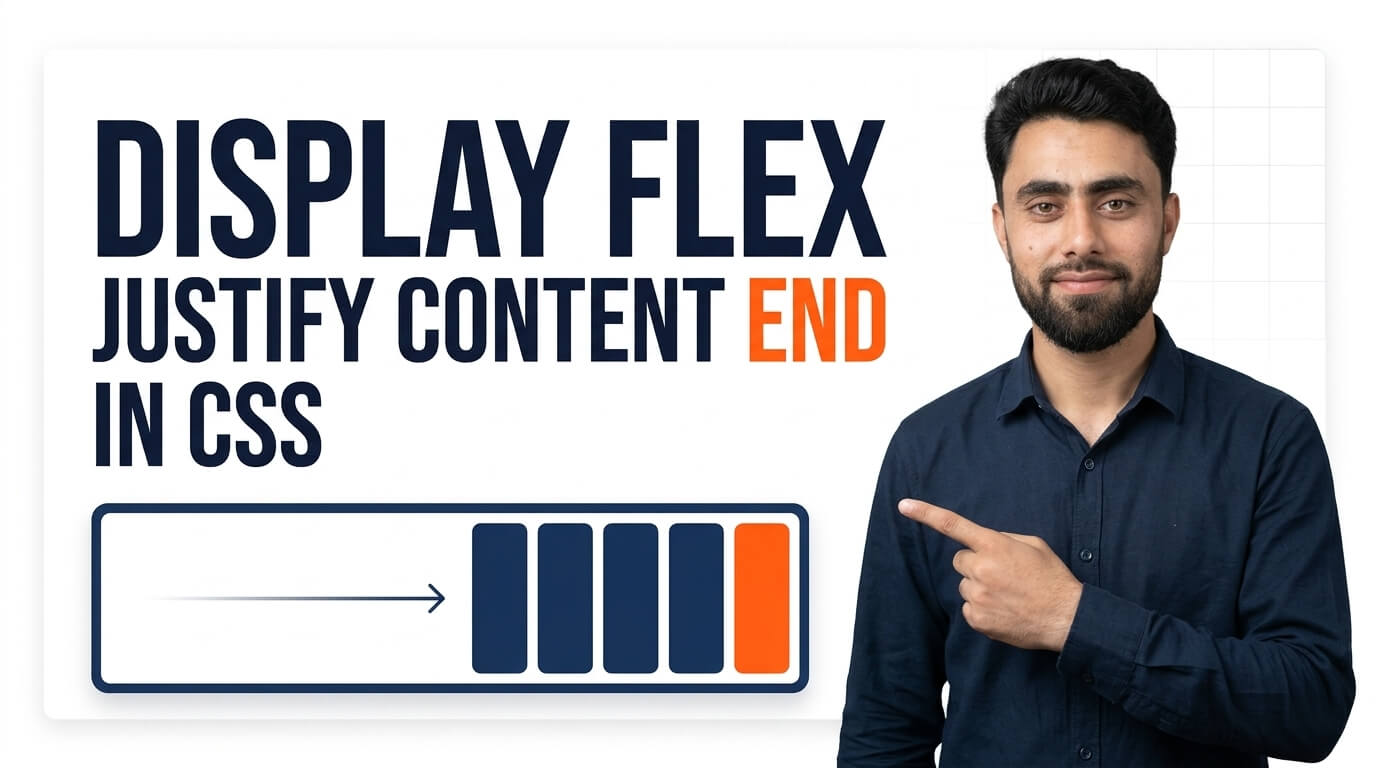
Here is a Display Flex Justify Content End in CSS
Get the code of Display Flex Justify Content End in CSS and watch video tutorials. You can practice using our code editor. Our practical guide will make your learning journey much easier. You can explore the tutorial and learn.
<div class="container">
  <div>1</div>
  <div>2</div>
  <div>3</div>
</div>
.container {
display: flex;
justify-content: flex-end;
background: dodgerblue;
}
.container div {
background: white;
padding: 15px;
margin: 5px;
}Display Flex Justify Content End in CSS
CSS Flexbox is one of the most useful tools for creating flexible and well-organized website layouts. It allows developers to control how elements are arranged inside a container without relying on complicated positioning methods. One helpful Flexbox feature is justify-content: flex-end, which moves items toward the end of the container’s main axis.
This property is especially useful when designing navigation bars, button groups, toolbars, and other layouts where elements need to appear on the right side or at the bottom of a section, depending on the flex direction.
What Does Justify Content Flex-End Mean?
The justify-content property controls how flex items are positioned along the main axis of a flex container. When its value is set to flex-end, the items are grouped at the end of that axis.
In a typical Flexbox layout, the default direction is a row. This means items are arranged horizontally, and justify-content: flex-end moves them toward the right side in a left-to-right layout.
However, the result depends on the direction of the flex container. If the container uses a column direction, the main axis becomes vertical, so the items move toward the bottom instead.
This makes flex-end a practical option for controlling alignment in different types of layouts.
Why Is Justify Content Flex-End Useful?
The justify-content: flex-end property gives developers a straightforward way to position a group of elements at the end of a container. Instead of adjusting each element separately, you can manage the alignment of the entire group through its parent container.
Here are some common situations where this property is useful:
- Navigation bars: Positioning menu links toward the right side of a header.
- Button groups: Aligning action buttons at the end of a form or content section.
- Website headers: Placing account links, search controls, or other elements at the end of a flex row.
- Product cards: Aligning action buttons at the bottom when the card layout is designed appropriately.
- Toolbars: Grouping related controls at one end of a horizontal container.
- Mobile layouts: Adjusting the position of interface elements when the flex direction changes.
Because the property works with the whole group of flex items, it can also help keep layouts easier to maintain as content changes.
How Does It Work in CSS?
To use justify-content: flex-end, the parent element must first become a flex container by using display: flex.
After Flexbox is enabled, the browser arranges the container’s direct children according to the chosen flex direction. The justify-content property then determines how those items are distributed along the main axis.
When flex-end is applied, the items move toward the end of that axis, leaving any available extra space before the group rather than after it.
The container’s available space is important. If the container only takes up as much room as its contents, there may be little or no visible movement. Giving the container sufficient width or height, where appropriate, makes the alignment easier to see.
The Difference Between Flex-End and Center
Both flex-end and center are values of the justify-content property, but they produce different alignment results.
With justify-content: center, the group of flex items is positioned in the middle of the main axis. With justify-content: flex-end, the group is positioned at the end of the main axis.
For example, in a standard horizontal row, center places the items in the middle, while flex-end moves them toward the right side in a left-to-right layout.
Choosing between them depends on the design you want to create. Center alignment can make a layout feel balanced, while end alignment is useful when actions or controls need to stay on one side of the interface.
Common Mistakes to Avoid
Although this property is simple, a few common mistakes can lead to unexpected results.
Forgetting to enable Flexbox: The justify-content property will not create the intended Flexbox layout unless the parent uses a compatible layout mode.
Applying the property to the wrong element: The property should generally be applied to the parent container whose direct children you want to align.
Confusing the main axis with the cross axis: In a row layout, the main axis is horizontal. In a column layout, it is vertical. Changing the flex direction changes where flex-end positions the items.
Expecting vertical alignment in a row: When the direction is a row, justify-content: flex-end controls horizontal placement, not vertical placement. The align-items property controls alignment along the cross axis.
Ignoring text direction: In right-to-left layouts, such as many Arabic-language websites, the relationship between the visual left and right sides and the flex direction can differ. It is better to understand the main axis than to assume flex-end always means the right side.
Best Practices for Using Flex-End
For predictable results, start by choosing the correct flex direction for your layout. Then use justify-content: flex-end when you want the group of items to move toward the end of that direction.
For layouts that need both horizontal and vertical alignment, combine justify-content with align-items where appropriate. You should also test your design on different screen sizes, especially if the container can wrap its items or change direction on mobile devices.
Avoid adding unnecessary margins to individual children just to move the entire group. Flexbox alignment properties are usually easier to manage and adjust when the layout changes.
Conclusion
The justify-content: flex-end property is a useful part of CSS Flexbox that allows developers to position items at the end of a container’s main axis. It can simplify the design of navigation bars, action buttons, headers, and many other website components.
By understanding how the main axis works and how flex direction affects alignment, you can use this property more confidently and build layouts that are cleaner, more flexible, and easier to maintain.
Ready to become a better coder? Don’t miss this tutorial! Add Pagination using CSS