
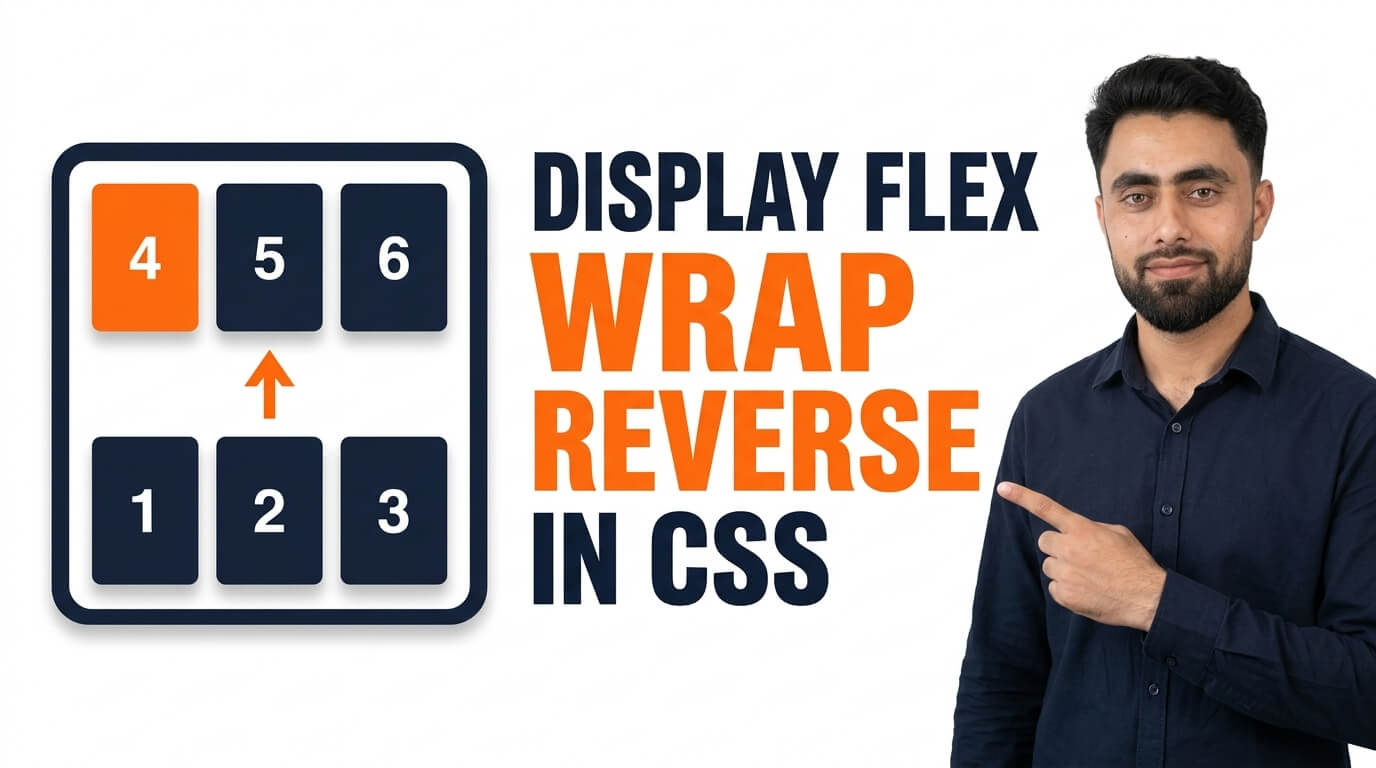
Here is a perfect tutorial of Display Flex Wrap Reverse in CSS
Get the code of Display Flex Wrap Reverse in CSS and watch video tutorials. You can practice using our code editor. Our practical guide will make your learning journey much easier. You can explore the tutorial and learn.
<div class="container">
  <div>1</div>
  <div>2</div>
  <div>3</div>
  <div>4</div>
  <div>5</div>
  <div>6</div>
</div>
.container {
background: dodgerblue;
display: flex;
flex-wrap: wrap-reverse;
}
.container div {
background: white;
margin: 5px;
padding: 15px;
}Display Flex Wrap Reverse in CSS
The CSS flex-wrap: wrap-reverse property helps developers create flexible layouts in which items can move onto multiple lines in the reverse direction of the cross axis. It is part of the Flexbox layout system and is useful when a design requires more control over how rows or columns are arranged inside a container.
When building a responsive website, elements such as cards, images, and buttons may not always fit on a single line. Instead of forcing them into a crowded layout, Flexbox allows items to wrap onto additional lines. The wrap-reverse value changes the direction in which those lines are arranged.
What Is Flex Wrap Reverse in CSS?
The flex-wrap property determines whether flex items stay on one line or wrap onto additional lines when the available space becomes limited.
There are three main values: nowrap, wrap, and wrap-reverse. The default value is nowrap, which keeps items on a single line. The wrap value allows items to move onto additional lines in the normal cross-axis direction, while wrap-reverse reverses that direction.
For example, in a horizontal flex container, normal wrapping generally creates additional rows below the first row. With wrap-reverse, the additional rows are arranged in the opposite direction, generally appearing above it.
How Does Flex Wrap Reverse Work?
To use this property, you first need to create a flex container by applying display: flex to a parent element. You can then use flex-wrap: wrap-reverse to allow items to wrap while reversing the cross-axis direction of the lines.
The result depends on the container’s flex-direction. With a row direction, the cross axis is vertical. With a column direction, the cross axis is horizontal.
One important detail is that wrap-reverse changes the arrangement of the lines, not the order of items within each line. This makes it different from flex-direction: row-reverse, which reverses the main-axis direction.
Benefits of Flex Wrap Reverse
The wrap-reverse property offers several useful advantages for specific layouts:
- Flexible line arrangement: Control where additional rows or columns appear.
- Responsive design: Allow items to wrap when space becomes limited.
- Greater layout control: Change the arrangement of lines without manually positioning each item.
- Design flexibility: Create alternative layouts for cards, images, and other components.
- Easy integration: Combine the property with other Flexbox settings to refine spacing and alignment.
Although normal wrapping is more common, wrap-reverse can be useful when a particular design calls for a reversed arrangement.
Common Uses of Flex Wrap Reverse
1. Image Galleries
Image galleries may use wrap-reverse when additional rows need to appear in the opposite cross-axis direction. This can support specific visual designs, although the layout should remain easy to follow.
2. Product Cards
An online store may use a reversed wrapping arrangement for a custom product section. However, normal wrapping is usually more intuitive for standard product grids.
3. Button Groups
When several buttons cannot fit on one line, wrap-reverse allows them to wrap into additional lines in the opposite cross-axis direction.
4. Custom Website Layouts
Developers can use this property when creating specialized arrangements that require more control over the direction of wrapped lines.
Important Flexbox Properties to Combine With Wrap Reverse
Several CSS properties work alongside flex-wrap: wrap-reverse.
Flex Direction: Determines whether items are arranged in rows or columns. It also establishes the main and cross axes.
Gap: Adds consistent spacing between flex items and between lines.
Justify Content: Controls how items are distributed along the main axis of each line.
Align Items: Controls the alignment of items along the cross axis within each line.
Align Content: Controls how multiple lines are distributed along the cross axis when the container has extra space available.
Using these properties together allows you to build more controlled and adaptable layouts.
Flex Wrap vs. Flex Wrap Reverse
The difference between wrap and wrap-reverse is the direction in which multiple lines are arranged.
With flex-wrap: wrap, additional lines follow the normal cross-axis direction. With flex-wrap: wrap-reverse, they follow the opposite direction.
Neither value automatically reverses the item order within each line. If you want to change the main-axis direction of the items, you should consider flex-direction instead.
Common Mistakes to Avoid
One common mistake is confusing wrap-reverse with row-reverse. These properties control different aspects of Flexbox: one reverses the direction of the lines, while the other reverses the main-axis direction of the items.
Another mistake is expecting a visible difference when all the items fit on one line. The reverse wrapping behavior becomes noticeable when the content requires multiple lines.
It is also important to consider accessibility. Visual arrangements should not make the content confusing for keyboard users or people who rely on assistive technologies.
Conclusion
The CSS flex-wrap: wrap-reverse property provides a simple way to reverse the cross-axis arrangement of wrapped flex lines. It can be useful for custom image galleries, product sections, button groups, and other layouts that require a different visual flow.
By understanding how wrap-reverse works with flex-direction, gap, and align-content, you can create more flexible website designs. Choose the wrapping direction that best suits your content, and always prioritize readability, accessibility, and a consistent user experience.
Ready to become a better coder? Don’t miss this tutorial! Add Pagination using CSS