
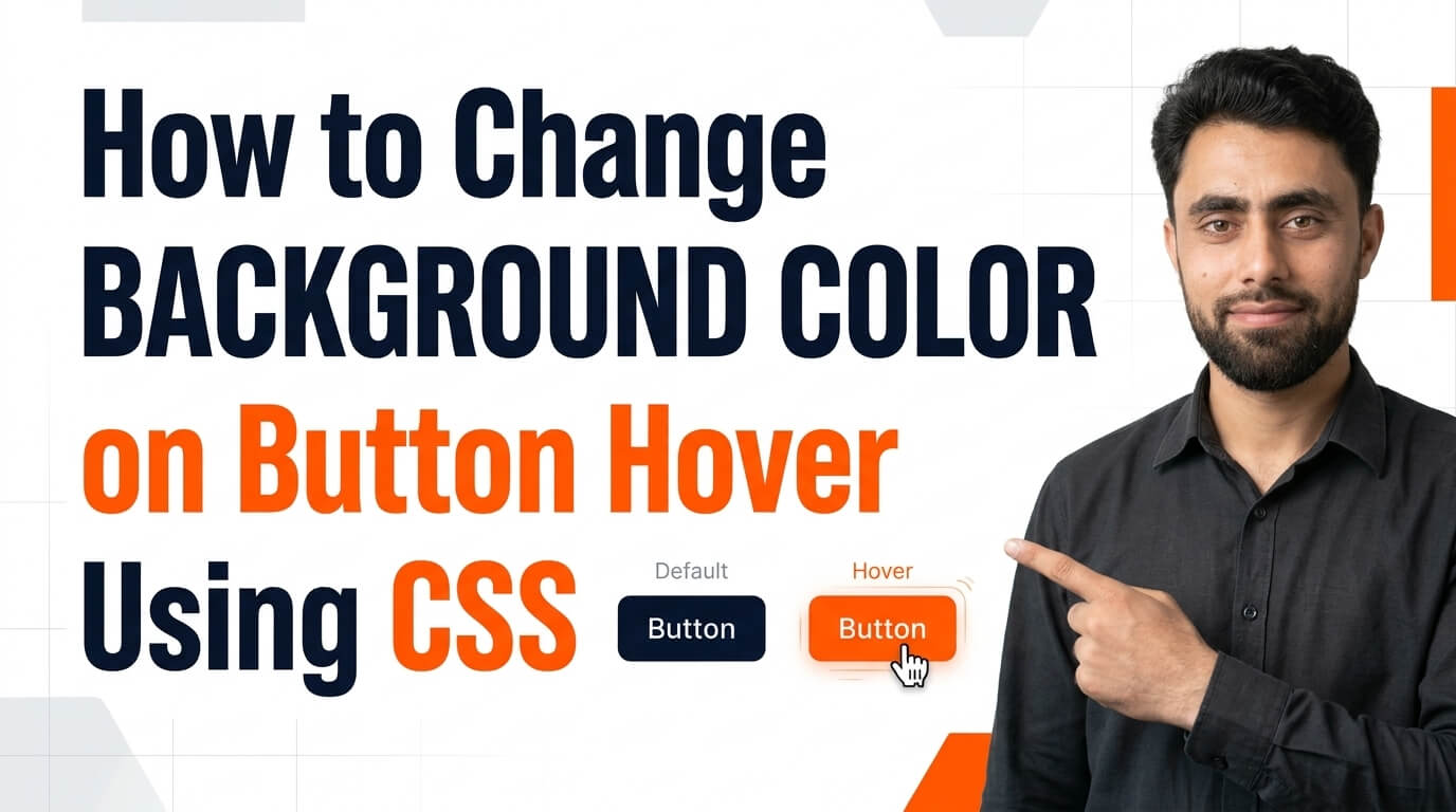
Do you know How to change background color on button hover using CSS?
Get the code of How to change background color on button hover using CSS and watch video tutorials. You can practice using our code editor. Our practical guide will make your learning journey much easier. You can explore the tutorial and learn.
<button id="btn1">Button 1</button>
<button id="btn2">Button 2</button>
button {
background: red;
color: white;
border: none;
padding: 15px 60px;
cursor: pointer;
border-radius: 5px;
border: 5px solid yellow;
}
#btn2 {
background: green;
}
#btn2:hover {
background: black;
}
#btn1:hover {
background: blue;
}Take your coding skills to the next level with this tutorial.: How to Make Buttons to Smart Button in Shopify ? Shows Colourful Bubbles on Hover.
How to Change Background Color on Button Hover Using CSS
Buttons are essential elements of modern websites. They help users submit forms, open pages, make selections, and interact with different features. A simple way to make buttons more attractive and interactive is to change their background color when a user moves the mouse pointer over them.
CSS makes this effect easy to create using the :hover pseudo-class. With just a few styling adjustments, developers can make buttons feel more responsive and give users clear visual feedback.
What Is the Button Hover Effect?
A button hover effect occurs when the appearance of a button changes as the mouse pointer moves over it. The change might involve the background color, text color, border, shadow, or size.
For example, a button might have a blue background by default and turn green when hovered over. This small visual change helps users recognize that the button is interactive.
Hover effects are commonly used on navigation buttons, contact forms, login pages, shopping websites, and call-to-action sections.
How Does CSS Change the Background Color?
CSS provides the :hover pseudo-class to apply styles when an element is hovered over by a pointing device. When this state is active, the button can display a different background color from its normal appearance.
The default background color defines how the button looks before interaction. The hover background color determines its appearance when the pointer moves over it.
Developers can also use the CSS transition property to make the color change appear smoother. Instead of changing instantly, the background gradually moves from one color to another over a short period.
This creates a more polished interaction without requiring JavaScript for a basic hover effect.
Benefits of Button Hover Effects
Better user experience: Visual feedback helps users understand which elements they can interact with.
Improved appearance: A carefully selected hover color makes buttons look more modern and professional.
Clear interaction: The change in appearance helps distinguish interactive buttons from static content.
Easy customization: Developers can experiment with different colors, transitions, borders, and shadows to match a website’s design.
Lightweight implementation: A simple CSS hover effect requires very little styling and does not need JavaScript.
Tips for Designing Attractive Hover Buttons
Choose colors that complement your website’s overall theme. For example, a blue button could become a darker blue on hover, while an orange button might use a deeper orange shade.
Maintain sufficient contrast between the button text and its background. The text should remain readable in both the normal and hover states.
Keep transitions subtle. A short, smooth color transition usually looks more professional than a slow or distracting animation. Consistent button styles across the website also help create a more organized interface.
It is important to remember that hover effects may not work in the same way on touchscreen devices. Mobile users often tap buttons instead of hovering over them, so the button must remain clear and usable without this effect.
For better accessibility, provide visible keyboard focus styling as well. Users who navigate with a keyboard should be able to identify the currently focused button without relying on a mouse hover.
Common Mistakes to Avoid
One common mistake is selecting a hover color that makes the button text difficult to read. Always check the contrast of both color combinations.
Another mistake is using too many effects at once. Excessive movement, shadows, and color changes can make a simple button distracting.
Developers should also avoid treating hover as the only indication of interactivity. Touchscreen users and keyboard users need appropriate visual feedback through other interaction states.
Finally, make sure the hover style does not conflict with other button states, such as disabled, active, and keyboard-focused states.
Conclusion
Changing a button’s background color on hover using CSS is a simple way to improve website interaction and visual appeal. The :hover pseudo-class allows developers to change the background color easily, while the transition property can make the effect smoother.
By choosing suitable colors, maintaining good contrast, and considering accessibility across different devices, you can create attractive buttons that look professional and provide a better user experience.