
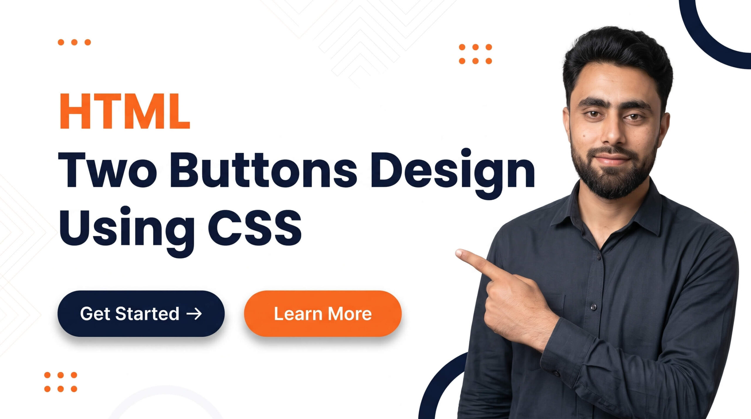
Best tutorial of how to make HTML Two Buttons Design using CSS
Get the code of HTML Two Buttons Design using CSS and watch video tutorials. You can practice using our code editor. Our practical guide will make your learning journey much easier. You can explore the tutorial and learn.
<button>Click Me 1</button>
<button>Click Me 2</button>
button {
display: block;
margin-top: 10px;
border: 2px solid green;
background: none;
padding: 5px 20px;
border-radius: 5px;
cursor: pointer;
}
button:hover {
background: black;
color: white;
}
button:first-child {
border: 2px solid red;
}
button:first-child:hover {
background: blue;
}HTML Two Buttons Design Using CSS
Buttons are essential elements of modern websites. They help visitors perform actions such as submitting forms, exploring products, signing up for services, or navigating to another page. A well-designed button makes these actions easier to understand and gives a website a more professional appearance.
Creating two buttons using HTML and CSS is a simple project for beginners who want to improve their web design skills. With HTML, you can define the buttons and their purpose, while CSS allows you to customize their colors, sizes, spacing, borders, and interactive effects.
Why Design Two Buttons on a Website?
Using two buttons together is common in modern web design. For example, a landing page might include a primary button labeled “Get Started” and a secondary button labeled “Learn More.” This arrangement helps visitors understand which action is most important while still offering another useful option.
Two-button designs are frequently used on business websites, product pages, portfolio websites, registration pages, and promotional banners. When designed consistently, they can make a page look organized and guide visitors toward the next step.
The Role of HTML in Button Design
HTML provides the structure and purpose of each button. The button element is suitable for actions such as submitting a form or triggering an interaction on the current page. If the goal is to navigate to another page, a link styled as a button is often more appropriate.
Choosing the correct element is important because it helps the website behave as visitors expect. It also improves accessibility and makes the interface easier to use with keyboards and assistive technologies.
How CSS Improves Button Appearance
CSS gives you control over almost every visual aspect of a button. You can change its background color, text color, font size, padding, border, and corner shape to match the overall design of your website.
For example, a primary button might use a bold background color to attract attention, while a secondary button could use a transparent background with a visible border. This contrast helps visitors distinguish between the two actions.
Rounded corners, balanced spacing, and consistent typography can also make buttons look more polished. However, the design should remain simple enough that users can immediately recognize each button as an interactive element.
Adding Hover Effects to Two Buttons
Hover effects provide visual feedback when a visitor moves a mouse pointer over a button. A button might become slightly darker, change its border color, or move upward by a small amount.
CSS transitions make these changes appear smoothly. Instead of changing instantly, the button gradually moves from its original appearance to the hover state.
For a two-button layout, you can give both buttons similar hover effects while using different colors to maintain their individual styles. This creates a consistent design without making the buttons look identical.
Remember that hover effects are mainly useful for mouse users. Mobile visitors may not have a mouse pointer, so the buttons should remain clear and functional without hover interactions.
Best Practices for a Professional Button Layout
When designing two buttons, pay attention to their size and spacing. Both buttons should be easy to click or tap, and there should be enough space between them to prevent accidental selections.
Use clear labels that describe what happens when a visitor selects a button. Short phrases such as “View Products,” “Contact Us,” or “Learn More” are usually more helpful than vague labels.
Color contrast is another important consideration. The text should be easy to read against the button background, and the buttons should remain distinguishable from surrounding content.
For responsive websites, check how the buttons appear on mobile devices. Two buttons may fit comfortably side by side on a desktop screen but require additional spacing or a stacked layout on a narrow screen.
Accessibility should also be part of the design process. Provide visible keyboard-focus indicators, use meaningful button labels, and ensure that each control performs its intended action.
Common Mistakes to Avoid
One common mistake is making both buttons equally prominent when one action should clearly take priority. Using a primary and secondary style can help establish a visual hierarchy.
Another mistake is adding excessive shadows, animations, or decorative effects. These details can make the interface feel cluttered and distract visitors from the purpose of the buttons.
Avoid using colors without checking readability, and do not forget to test the buttons on different screen sizes. A button that looks attractive but is difficult to tap or understand will provide a poor user experience.
Conclusion
Designing two buttons using HTML and CSS is a practical way to learn the fundamentals of web interface design. HTML defines the elements and their purpose, while CSS controls their appearance and interactive effects.
By choosing clear labels, maintaining consistent spacing, using complementary styles, and adding subtle hover effects, you can create an attractive two-button layout for almost any website. Always prioritize accessibility, responsiveness, and usability so visitors can interact with your buttons comfortably on any device.
level up your coding by checking this article tutorial too: How to create videos slider section in shopify store?