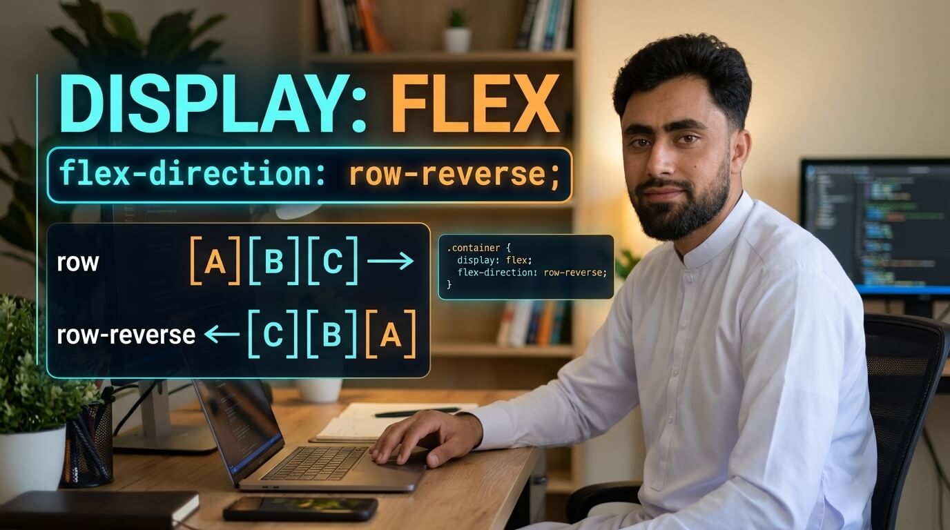
Here is a Display Flex Direction Row Reverse in CSS
Get the code of Display Flex Direction Row Reverse in CSS and watch video tutorials. You can practice using our code editor. Our practical guide will make your learning journey much easier. You can explore the tutorial and learn.
<div class="container">
  <div>1</div>
  <div>2</div>
  <div>3</div>
  <div>4</div>
</div>
.container {
background: dodgerblue;
display: flex;
flex-direction: row-reverse;
}
.container div {
background: white;
padding: 15px;
margin: 5px;
}Display Flex Direction Row Reverse in CSS
The CSS display: flex and flex-direction: row-reverse properties are useful for creating flexible layouts where elements appear horizontally in reverse order. They give developers greater control over how items are arranged inside a container, making it easier to build navigation menus, button groups, headers, and other website components.
Flexbox is widely used in modern web development because it simplifies alignment and spacing. By combining these two properties, you can change the visual direction of a layout without manually positioning each element.
What Is Display Flex Direction Row Reverse?
The display: flex property turns an HTML element into a flex container. Its direct children become flex items that can be arranged and aligned using Flexbox properties.
The flex-direction: row-reverse property arranges these items in the reverse direction of a normal row.
For example, imagine a container with three items labeled A, B, and C. With the default row direction in a left-to-right layout, the items appear as A, B, C. When row-reverse is applied, their visual order becomes C, B, A.
The exact left-to-right or right-to-left appearance depends on the writing direction of the document.
How Does Row Reverse Work?
To use row-reverse, you first need a flex container. The display: flex declaration activates the Flexbox layout, while flex-direction: row-reverse determines the direction of the main axis.
This means the items are still part of the same container, but their visual arrangement changes. You can also combine row-reverse with other properties to control spacing, alignment, and wrapping.
It is important to remember that row-reverse changes the visual order of flex items, not their underlying order in the HTML document. This distinction can affect keyboard navigation and accessibility, so the original document order should remain meaningful.
Benefits of Display Flex Direction Row Reverse
This combination provides several useful advantages for website design.
- Reverse horizontal arrangements: Display items in the opposite direction of a normal row.
- Flexible layouts: Adjust the appearance of headers, menus, and button groups.
- Simple alignment: Combine Flexbox with other properties to control item positioning.
- Less manual positioning: Change the layout direction without moving each item individually.
- Cleaner CSS: Keep layout rules organized within the flex container.
These benefits make row-reverse a useful option when a design requires a different visual arrangement.
Common Uses of Row Reverse
1. Website Navigation
Navigation links can be arranged in reverse visual order when required by a particular design. This can be useful for alternative header layouts and interface variations.
2. Button Groups
A group of buttons can be displayed in reverse order to match a specific layout. However, the visual arrangement should still make the intended action sequence clear.
3. Website Headers
Developers can use row-reverse to experiment with the positioning of navigation links and other header elements within a flexible layout.
4. Content Sections
A section containing several horizontal elements can use row-reverse when the design calls for a reversed arrangement. For more complex page layouts, CSS Grid may provide additional control.
Important Properties to Combine With Row Reverse
Several CSS properties can improve a row-reverse layout.
Justify Content: Controls how flex items are distributed along the main axis. Because row-reverse reverses that axis, the visual effect of flex-start and flex-end may differ from a normal row.
Align Items: Controls alignment along the cross axis, which is generally vertical for a horizontal flex layout.
Gap: Adds consistent space between items without requiring separate margins on each element.
Flex Wrap: Allows items to move onto additional lines when the container lacks sufficient space. The reversed main-axis direction also affects their arrangement.
Together, these properties provide more control over the final design.
Common Mistakes to Avoid
A frequent mistake is assuming that row-reverse changes the HTML source order. It does not; it changes how the items are visually arranged. If this creates a mismatch between the visual sequence and the logical reading order, users who rely on keyboards or assistive technologies may find the interface confusing.
Another mistake is misunderstanding how justify-content behaves after reversing the main axis. Remember that alignment follows the axis direction rather than always referring to the left or right side of the screen.
For the best results, keep the HTML structure logical and use reversed layouts only when they improve the user’s experience.
Conclusion
The CSS combination of display: flex and flex-direction: row-reverse provides a simple way to arrange elements horizontally in reverse visual order. It is useful for navigation menus, button groups, headers, and other interface components that require flexible positioning.
By combining these properties with justify-content, align-items, and gap, you can create clean and adaptable layouts. Always consider accessibility and the logical order of your content when changing the visual arrangement of elements.
Ready to become a better coder? Don’t miss this tutorial! Add Pagination using CSS