
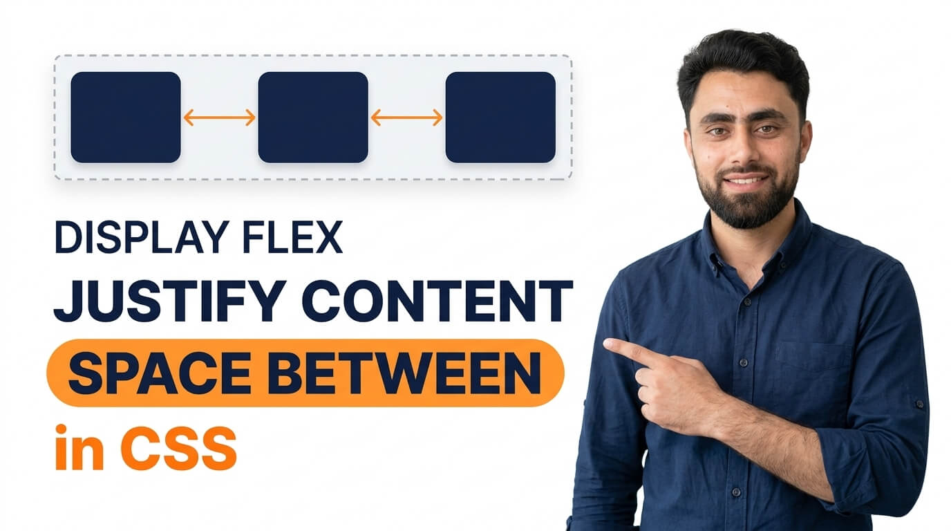
Get the code of Display Flex Justify Content Space Between in CSS and watch video tutorials. You can practice using our code editor. Our practical guide will make your learning journey much easier. You can explore the tutorial and learn.
<div class="container">
  <div>1</div>
  <div>2</div>
  <div>3</div>
</div>
.container {
background: dodgerblue;
color: white;
display: flex;
justify-content: space-between;
}
.container div {
margin: 5px;
padding: 5px 10px;
background: white;
color: red;
}Display Flex Justify Content Space Between in CSS
The justify-content: space-between property in CSS is a simple and useful way to arrange elements horizontally with equal space between them. It is commonly used in website layouts, navigation bars, card sections, headers, and other areas where elements need to be distributed neatly across a container.
When building a modern website, keeping elements organized is important for creating a clean and professional design. CSS Flexbox makes this task easier, and space-between is one of its most practical alignment options.
What Is Justify Content Space Between in CSS?
The justify-content property controls how flex items are distributed along the main axis of a flex container. When you use the space-between value, the browser places the first item at the beginning of the container and the last item at the end. Any remaining space is distributed evenly between the items.
For example, imagine a website header containing a logo, navigation links, and a login button. Instead of manually adding margins to each element, you can use Flexbox with justify-content: space-between to position the elements across the available space.
This approach helps create balanced layouts while reducing the need for unnecessary spacing adjustments.
How Does Space Between Work?
The space-between value distributes the available free space between flex items. It does not add equal space around every item.
If a flex container has three items, the first item stays at the start, the last item stays at the end, and the remaining space is divided into two equal gaps between the items.
The result depends on the size of the container and the width of its contents. If the items occupy most of the available space, the gaps will be smaller. If they occupy less space, the gaps will become larger.
It is also important to understand that justify-content works along the main axis. In a row-based flex container, this is usually the horizontal direction. If the flex direction is changed to a column, the main axis becomes vertical.
Common Uses of Justify Content Space Between
1. Creating a Website Navigation Bar
Navigation bars often contain a logo on one side and links or buttons on the other. Using Flexbox with space-between makes it easier to distribute these elements across the header without relying on complicated positioning.
2. Arranging Cards
When displaying product cards, service boxes, or feature sections, space-between can help spread the items across a container. However, if you need consistent gaps between several items, the gap property or CSS Grid may be more suitable.
3. Designing Headers and Footers
A header may include a website logo and an account button, while a footer may place copyright information on one side and social links on the other. The space-between value helps keep these elements separated and organized.
4. Aligning Content in One Row
It is also useful when arranging labels, prices, action buttons, or other interface elements in a single row. It provides a straightforward way to separate content without manually calculating margins.
Benefits of Using Space Between
One of the main advantages of justify-content: space-between is simplicity. You can distribute elements across a flex container with a single CSS property instead of adjusting the spacing of individual elements.
It also helps create flexible layouts. When the container changes size, the browser recalculates the available space automatically, allowing the items to adapt to the new layout.
Another benefit is maintainability. If you add or remove an item, the browser redistributes the available space between the remaining items. This can make website layouts easier to update.
Common Mistakes to Avoid
A common mistake is forgetting to apply display: flex to the parent container. The justify-content property controls flex or grid container alignment, but space-between behaves differently depending on the layout system.
Another mistake is expecting equal space around every item. Unlike space-around and space-evenly, the space-between value places free space only between items, leaving no extra distributed space before the first item or after the last item.
You should also consider smaller screens. A layout that looks balanced on a desktop may become crowded on a mobile device. Responsive design techniques, such as allowing items to wrap or changing their direction, can help prevent this problem.
Finally, remember that space-between distributes only the available free space. If the items already fill the container, there may be little or no extra space to distribute.
Conclusion
CSS Flexbox justify-content: space-between is an effective way to create organized and balanced website layouts. It places the first item at the beginning of a flex container, the last item at the end, and distributes the remaining space evenly between the items.
Whether you are designing a navigation bar, arranging website content, or building a responsive header, this property can help you achieve a cleaner layout with less effort. Understanding how it works alongside other Flexbox properties will make it easier to build attractive and flexible websites.
Ready to become a better coder? Don’t miss this tutorial! Create a Basic HTML CSS Website Home Page
