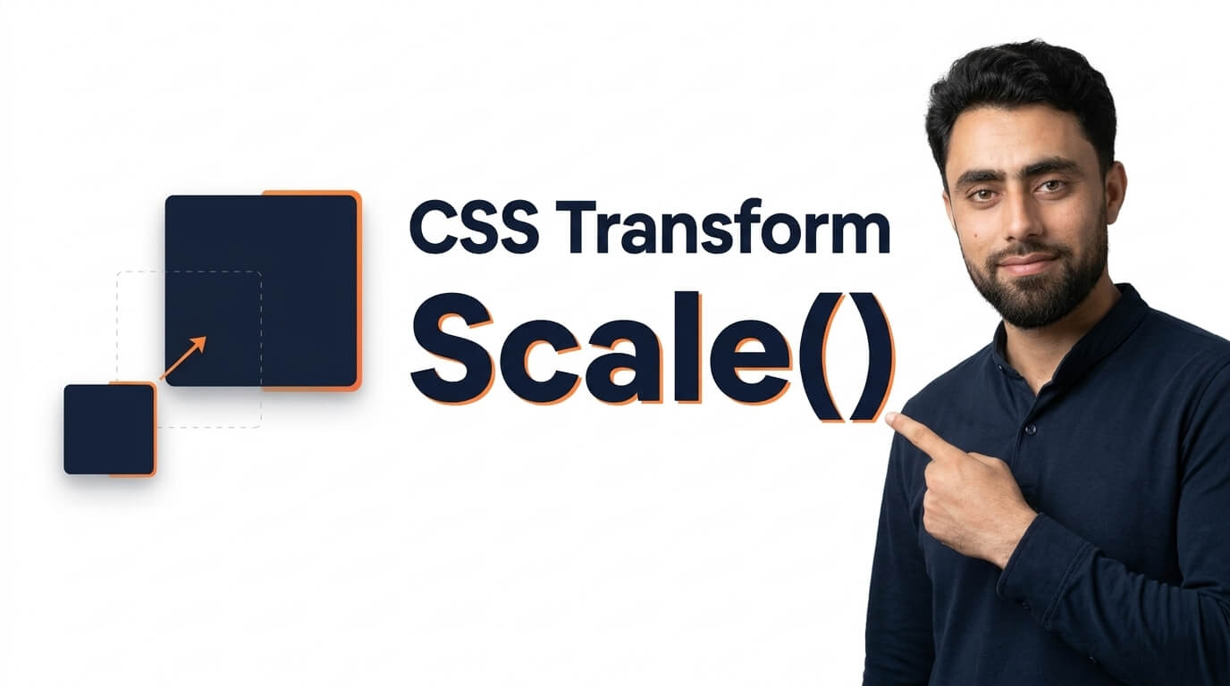
How to do CSS Transform Scale
Get the code of CSS Transform Scale and watch video tutorials. You can practice using our code editor. Our practical guide will make your learning journey much easier. You can explore the tutorial and learn.
<div>Scaled</div>div {
background: lightblue;
width: 50px;
height: 50px;
padding: 5px;
margin-left: 40px;
margin-top: 40px;
transform: scale(2,2)
}CSS Transform Scale
CSS transforms allow developers to change the appearance of HTML elements without modifying their original position in the document layout. One useful transform function is scale(), which makes an element appear larger or smaller. It is commonly used for image zoom effects, interactive buttons, product cards, and modern website animations.
With CSS transform: scale(), you can create engaging visual effects using just a few styling properties, without needing JavaScript for basic scaling interactions.
What Is Scale in CSS?
The scale() function is part of the CSS transform property. It changes the visual size of an element by multiplying its original dimensions by a specified value.
For example, a scale value greater than 1 makes an element appear larger, while a value between 0 and 1 makes it appear smaller. A value of 1 keeps the element at its original visual size.
CSS supports scaling in both horizontal and vertical directions. Developers can enlarge an element proportionally or adjust its width and height independently to create different visual effects.
How Does CSS Transform Scale Work?
The scale() function applies a scaling transformation to an element. When the scale value increases, the element expands visually. When the value decreases, the element shrinks.
The transformation can be applied to images, buttons, icons, cards, and other HTML elements. It can also be combined with CSS transitions to make changes happen smoothly.
For example, an image might grow slightly when a user hovers over it, making the page feel more interactive. Similarly, a button can become a little larger when hovered over to provide visual feedback.
One important detail is that scaling changes the element’s visual appearance but does not change the space it originally occupies in the document layout. As a result, a scaled element may overlap nearby content.
Benefits of Using CSS Scale
Interactive effects: Scaling makes buttons, images, and cards feel more responsive to user actions.
Image zoom: Developers can create simple zoom effects without editing the original image.
Smooth animations: When combined with CSS transitions, scaling can create polished visual movement.
Flexible styling: Elements can be enlarged or reduced proportionally, or scaled differently along the horizontal and vertical axes.
Simple implementation: Basic scaling effects can be created entirely with CSS, reducing the need for additional JavaScript.
Common Uses of Transform Scale
The scale() function is widely used in modern web design.
Image hover effects: Images can enlarge slightly when a user moves the pointer over them.
Button interactions: Buttons can grow subtly to provide feedback when users interact with them.
Product cards: Online stores can use scaling to highlight product images or cards.
Navigation icons: Small icons can expand slightly to emphasize an interactive state.
Animated elements: Scaling can be used in entrance animations, loading effects, and other visual transitions.
For the best results, use scaling to support the interface rather than adding movement to every element on the page.
Tips for Creating Better Scale Effects
Start with small scaling values. A subtle enlargement often looks more professional than an extreme zoom effect.
Use the CSS transition property when you want the element to scale smoothly between states. This helps prevent abrupt changes that can make an interface feel unfinished.
The transform-origin property is also useful because it determines the point from which an element scales. By default, scaling usually occurs around the center of the element, but you can adjust the origin when a different effect is needed.
Consider responsive behavior as well. An element that looks good when enlarged on a desktop screen might become too large on a mobile device.
Finally, make sure scaling does not hide text, cover important controls, or create unwanted overlap with neighboring elements.
Common Mistakes to Avoid
One frequent mistake is using excessively large scale values, which can make elements look distorted or cover other content.
Another mistake is assuming that scaling changes the element’s original layout dimensions. Since the surrounding layout generally remains unchanged, developers should check whether the transformed element overlaps nearby items.
Avoid applying too many scaling effects at once, as excessive movement can distract users. For accessibility, consider reduced-motion preferences when creating animations and ensure that essential information does not depend on a hover effect.
Conclusion
CSS transform: scale() is a simple and effective way to resize elements visually and create interactive website effects. From image zooms to animated buttons and product cards, scaling can improve the appearance of a design when used carefully.
By choosing appropriate scale values, adding smooth transitions, and checking how transformed elements interact with nearby content, developers can create attractive, responsive, and user-friendly web experiences.
Ready to become a better coder? Don’t miss this tutorial! Create a Basic HTML CSS Website Home Page