
How to do CSS Transform Translate? here is a perfect tutorial
Get the code of CSS Transform Translate and watch video tutorials. You can practice using our code editor. Our practical guide will make your learning journey much easier. You can explore the tutorial and learn.
<div>Original</div>
<div id="mydiv">Transformed</div>
div {
background: yellow;
padding: 5px;
margin: 5px;
width: 100px;
height: 50px;
}
#mydiv {
transform: translate(50px,20px)
}CSS Transform Negative Rotate
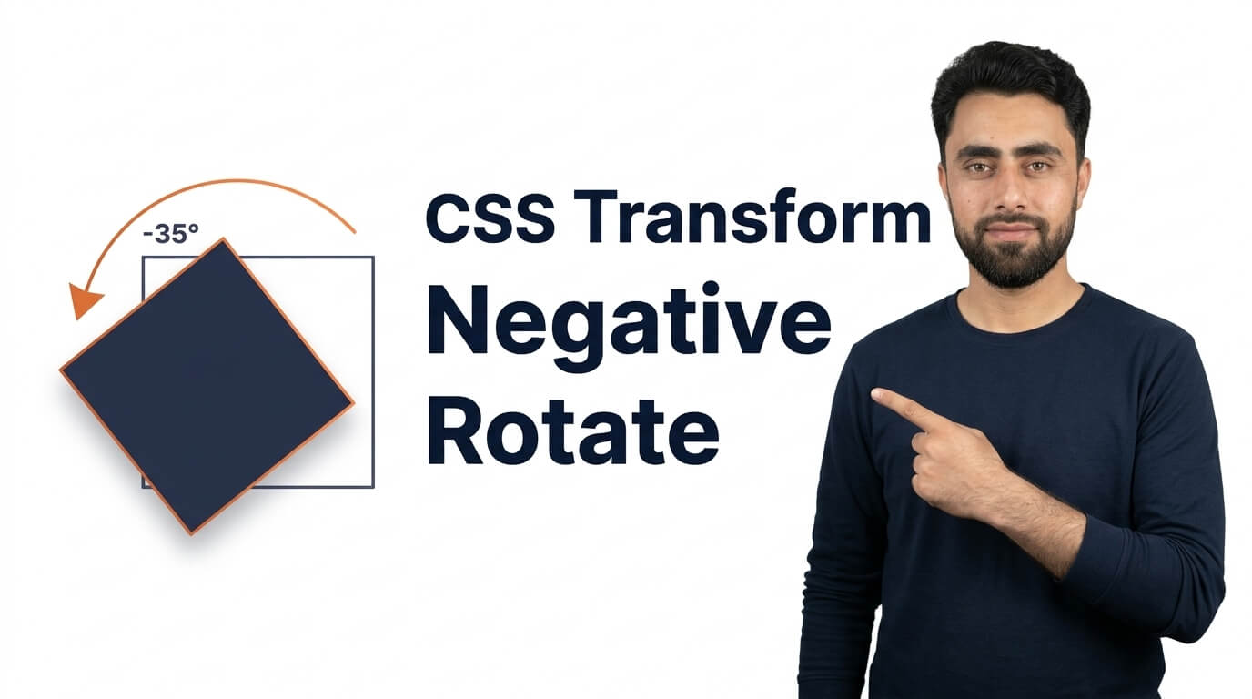
CSS transforms are useful for changing the appearance and position of HTML elements without affecting the normal document flow. One simple but powerful transform is negative rotation, which allows you to rotate an element in the opposite direction from a positive angle.
The transform: rotate() function makes it easy to rotate images, icons, buttons, text, and other website elements. By using a negative value, you can create different visual effects and add more creativity to your web design.
What Is Negative Rotation in CSS?
Negative rotation means rotating an element by a negative angle, such as -30 degrees or -90 degrees. In CSS, the rotate() function accepts positive and negative angle values.
A positive angle rotates an element clockwise, while a negative angle rotates it counterclockwise in the usual two-dimensional CSS coordinate system.
For example, rotating an image by -45 degrees turns it 45 degrees counterclockwise. This can be useful when you want to tilt an image, adjust an icon’s direction, or create an interesting visual effect.
How Does CSS Negative Rotate Work?
The CSS transform property supports the rotate() function, which changes the orientation of an element around its transform origin.
The angle determines how far the element rotates. You can use degrees (deg), radians (rad), turns (turn), or other supported CSS angle units.
Here are a few examples of negative rotation angles:
- -15 degrees: Creates a slight counterclockwise tilt.
- -45 degrees: Rotates an element diagonally.
- -90 degrees: Turns an element a quarter turn counterclockwise.
- -180 degrees: Rotates an element halfway around.
The rotation happens around the element’s center by default. However, you can change the rotation point with the transform-origin property to achieve different results.
Common Uses of Negative Rotation in Web Design
1. Rotating Images
Negative rotation can make images look more dynamic. For example, a designer might tilt a product image slightly to create a more engaging layout or give a collection of images a casual, layered appearance.
2. Styling Icons
Icons such as arrows, chevrons, and decorative symbols can be rotated to match the direction or style of a user interface. Negative rotation is particularly useful when an icon needs to face the opposite direction.
3. Creating Creative Buttons
A small rotation can make a button or decorative element stand out. When combined with transitions and hover effects, rotation can add a subtle sense of movement to interactive elements.
However, it is best to keep these effects restrained so that buttons remain easy to read and use.
4. Adding Decorative Shapes
Web designers often use rotated squares, lines, and other shapes as background decorations. Negative rotation helps create diagonal patterns and geometric effects without requiring images.
5. Building Animation Effects
Negative rotation can also be used in CSS animations. An element can rotate from a negative angle to zero, creating an effect that looks like it is straightening into position. These animations can make page elements feel more lively when used appropriately.
Benefits of Using Negative Rotate
One major benefit is that negative rotation is simple to apply. You can change the angle of an element without editing the original image or creating additional graphics.
It is also flexible. The rotation angle can be adjusted for different screen sizes, hover states, and animation effects. Since CSS transforms generally do not change the space an element occupies in the normal document flow, nearby elements usually remain in their original layout positions.
Negative rotation can also be combined with other transform functions, such as scale() and translate(), to create more complex visual effects.
Common Mistakes to Avoid
A common mistake is assuming that negative rotation moves an element to the left or downward. Rotation changes an element’s orientation; it does not directly control its position. Use translation when you need to move an element horizontally or vertically.
Another mistake is using rotation angles that make text difficult to read. Large or unnecessary rotations can reduce readability and make a website feel cluttered.
You should also remember that rotated elements may extend beyond their original boundaries. This can cause unexpected overlap or clipping, especially when a parent container uses hidden overflow.
Finally, when creating animated rotation effects, consider users who prefer reduced motion. Respecting their system preferences can make your website more accessible.
Conclusion
CSS Transform Negative Rotate is a useful technique for adding direction, movement, and visual interest to web elements. By using negative angles with the rotate() function, you can rotate images, icons, buttons, and decorative shapes counterclockwise.
Whether you are building a modern website layout or adding subtle animation effects, understanding negative rotation gives you more control over your designs. Use it thoughtfully, combine it with other CSS properties when needed, and keep usability and accessibility in mind for the best results.
Ready to become a better coder? Don’t miss this tutorial! Create a Basic HTML CSS Website Home Page
