
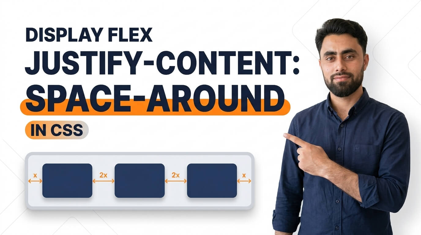
Here is how to Display Flex Justify Content Space Around in CSS
Get the code of Display Flex Justify Content Space Around in CSS and watch video tutorials. You can practice using our code editor. Our practical guide will make your learning journey much easier. You can explore the tutorial and learn.
<div class="container">
  <div>1</div>
  <div>2</div>
  <div>3</div>
</div>
.container {
background: dodgerblue;
display: flex;
justify-content: space-around;
}
.container div {
background: white;
margin: 5px;
padding: 5px 10px;
}Display Flex Justify Content Space Around in CSS
CSS Flexbox is a powerful layout system that helps developers arrange elements inside a container and control the space between them. One useful Flexbox property is justify-content: space-around, which distributes items along the main axis while adding space around each item.
This property is especially helpful when designing navigation menus, product cards, feature sections, and responsive website layouts. It allows developers to create balanced spacing without manually adding margins to every element.
What Is Justify Content Space Around?
The justify-content property controls how flex items are distributed along the main axis of a flex container. When its value is set to space-around, each item receives equal space on both sides.
Because the spaces beside items are shared, the gap between two neighboring items is twice the space at either outer edge, assuming the items have no additional margins.
For example, imagine a row containing three navigation links. Using space-around distributes the available space around all three links, helping the row look balanced within its container.
How Does Display Flex Work?
To use justify-content: space-around, the parent element must be a flex container. This is commonly achieved with the CSS display: flex property.
Once Flexbox is enabled, its child elements become flex items. The justify-content property then determines how those items are positioned along the main axis.
In the default row direction, the main axis runs horizontally. If the flex direction is changed to a column, the main axis becomes vertical.
The amount of space available for distribution depends on the size of the container and the total space occupied by its items. If there is little or no extra space, the visual effect of space-around will be limited.
Difference Between Space Around and Other Values
Flexbox provides several values for controlling item distribution, and each creates a different layout.
Space around: Adds equal space around every item. The gaps between neighboring items are larger than the spaces at the two outer edges.
Space between: Places the first item at the beginning and the last item at the end, distributing the remaining space between items.
Space evenly: Distributes equal space between all items and between the items and the container’s edges.
Center: Groups items together in the center of the container, leaving unused space on the outside.
Understanding these differences helps developers select the right spacing method for a particular design.
Benefits of Using Space Around
Balanced layouts: Items receive space on both sides, creating a visually organized arrangement.
Less manual styling: Developers can distribute available space without setting individual margins on every child element.
Flexible design: The spacing adjusts as the container’s available space changes.
Cleaner navigation: Navigation links and menu items can be distributed evenly across a header.
Useful for responsive interfaces: Flexbox can work alongside media queries to adapt layouts for different screen sizes.
Common Uses in Web Design
The space-around value is useful for horizontal navigation menus, rows of product cards, service icons, feature lists, and other groups of elements.
For example, an online store might use it to distribute several product summaries within a section. A portfolio website could use it to arrange skill categories, while a business homepage might use it to space out service highlights.
However, space-around is not always the best choice. If the first and last items must align exactly with the container’s edges, space-between may be more appropriate.
Tips for Better Flexbox Layouts
Start by choosing a suitable width for the flex container. If the container is too narrow, the items may appear crowded or wrap unexpectedly.
Remember that justify-content controls spacing along the main axis, while align-items controls alignment along the cross axis. Understanding this distinction makes Flexbox easier to use.
For smaller screens, consider whether the items should wrap onto additional lines. The flex-wrap property can help prevent content from becoming cramped, and responsive media queries can adjust spacing when necessary.
Also, avoid combining large child margins with space-around unless you specifically need the extra spacing. Doing so can make the gaps look uneven or excessive.
Conclusion
CSS display: flex combined with justify-content: space-around provides a simple way to distribute items with balanced space around each one. It is useful for navigation menus, feature sections, product layouts, and many other web design components.
By understanding how the main axis works and how space-around differs from other Flexbox values, developers can create cleaner, more flexible, and responsive layouts with less manual styling.
Ready to become a better coder? Don’t miss this tutorial! Create a Basic HTML CSS Website Home Page