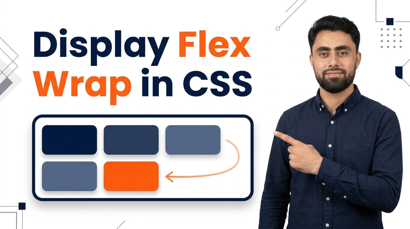
Display Flex Wrap in CSS
Get the code of Display Flex Wrap in CSS and watch video tutorials. You can practice using our code editor. Our practical guide will make your learning journey much easier. You can explore the tutorial and learn.
<div class="container">
  <div>1</div>
  <div>2</div>
  <div>3</div>
  <div>4</div>
  <div>5</div>
  <div>6</div>
  <div>7</div>
  <div>8</div>
</div>
.container {
background: dodgerblue;
display: flex;
flex-wrap: wrap;
}
.container div {
background: white;
padding: 15px;
margin: 5px;
}Display Flex Wrap in CSS
The CSS flex-wrap property is an important part of the Flexbox layout system. It determines whether flex items remain on a single line or move onto additional lines when there is not enough space inside their container.
When building a website, you may need to display several cards, images, buttons, or other elements in a flexible layout. Without proper wrapping, these items may become crowded or extend beyond their container. The flex-wrap property helps prevent this problem and makes layouts more adaptable to different screen sizes.
What Is Flex Wrap in CSS?
The flex-wrap property controls how flex items behave when they reach the available space in a flex container.
By default, Flexbox uses flex-wrap: nowrap, which keeps items on a single line. If the items need more space than the container provides, they may shrink or overflow, depending on their sizing and other CSS properties.
When you use flex-wrap: wrap, items can move onto additional lines as needed. This is especially useful for responsive layouts where the available width changes between desktop computers, tablets, and mobile phones.
To use this property, the parent element must have display: flex.
Different Values of Flex Wrap
The flex-wrap property has three main values, each offering a different layout behavior.
1. Nowrap
The nowrap value is the default behavior. It keeps all flex items on one line, even when the container becomes narrow.
This option can be useful for navigation bars or toolbars where keeping items together is important. However, you may need additional styling to prevent unwanted overflow on smaller screens.
2. Wrap
The wrap value allows flex items to move onto additional lines when there is insufficient space on the current line.
For example, a product gallery may display four cards in one row on a large screen but automatically move some cards onto another row when the screen becomes smaller.
This behavior makes wrap a useful choice for image galleries, product listings, button groups, and other flexible components.
3. Wrap Reverse
The wrap-reverse value allows items to wrap onto multiple lines in the opposite cross-axis direction.
For a typical horizontal flex container, additional rows are arranged in the opposite vertical direction compared with normal wrapping. The items’ order along each row is not automatically reversed.
This value is useful when a particular design requires a different arrangement of wrapped lines, although normal wrapping is more common in everyday web development.
Why Is Flex Wrap Important?
Flex wrap helps developers create layouts that respond naturally to available space instead of relying entirely on fixed widths or manual positioning.
Its main advantages include:
- Responsive design: Items can move to new lines when space becomes limited.
- Better organization: Content remains grouped within its container.
- Improved readability: Cards and buttons can avoid becoming unnecessarily crowded.
- Flexible layouts: The same component can adapt to different screen sizes.
- Less manual adjustment: Developers can reduce the need for separate positioning rules.
These benefits make flex-wrap particularly useful for modern websites that need to work well across different devices.
Common Uses of Flex Wrap
Product Galleries
Online stores often display several products side by side. With wrapping enabled, product cards can move onto additional rows as the available width decreases.
Image Collections
Photo galleries can use Flexbox wrapping to display images in organized rows without requiring every item to have a fixed position.
Button Groups
When a section contains multiple buttons or tags, wrapping allows them to move onto another line rather than becoming cramped on smaller screens.
Website Components
Cards, categories, labels, and other repeated elements can use wrapping to create layouts that remain organized as the container changes size.
Flex Wrap and Other Flexbox Properties
The flex-wrap property works alongside several other Flexbox properties.
Display Flex: Activates the Flexbox layout system and makes the element a flex container.
Flex Direction: Determines whether items are arranged in a row or column. Wrapping follows the main axis established by this direction.
Gap: Adds consistent spacing between flex items and between wrapped lines.
Justify Content: Controls how items are distributed along the main axis of each line.
Align Items: Controls alignment along the cross axis within a line.
Align Content: Controls the distribution of multiple flex lines when there is extra space in the cross axis. It has a visible effect when the container has multiple lines and sufficient cross-axis space.
Understanding how these properties work together makes it easier to create layouts with predictable spacing and alignment.
Common Mistakes to Avoid
One common mistake is expecting flex-wrap: wrap to make every item automatically fit perfectly. Wrapping depends on the container’s available space, the size of its children, and other Flexbox settings.
Another mistake is forgetting to use display: flex. The flex-wrap property does not create a flex container by itself.
You should also avoid relying only on fixed widths. Combining flexible item sizing, suitable gaps, and wrapping often produces a more adaptable layout.
Finally, remember that wrapping does not automatically guarantee a good mobile design. Test your layout at different screen sizes to ensure the items remain readable and comfortable to use.
Conclusion
The CSS flex-wrap property gives developers control over how flex items behave when space becomes limited. By choosing between nowrap, wrap, and wrap-reverse, you can create different arrangements that suit your website’s layout requirements.
When combined with display: flex, gap, and other Flexbox properties, flex-wrap makes it easier to build responsive product galleries, image collections, button groups, and content sections. Learning how to use it effectively will help you create cleaner and more adaptable web designs.
Ready to become a better coder? Don’t miss this tutorial! Add Pagination using CSS