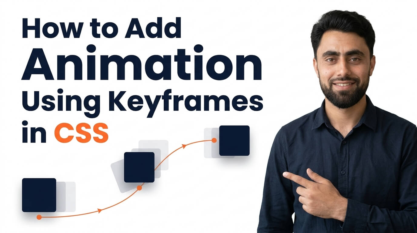
here is How to add Animation using Keyframes in CSS
Get the code of How to add Animation using Keyframes in CSS and watch video tutorials. You can practice using our code editor. Our practical guide will make your learning journey much easier. You can explore the tutorial and learn.
<div></div>div {
background: cyan;
width: 50px;
height: 50px;
animation: ramzan 5s infinite;
position: relative;
}
@keyframes ramzan {
from {left: 0px;}
to {left: 200px;}
}Ready to become a better coder? Don’t miss this tutorial! How to add Animation delay in CSS
How to Add Animation Using Keyframes in CSS
CSS animations are an excellent way to make websites more interactive, modern, and visually appealing. They allow developers to add movement to buttons, images, headings, backgrounds, and other HTML elements without relying on JavaScript for every effect.
One of the most important features for creating CSS animations is the @keyframes rule. It allows you to define how an element changes over time, giving you control over its movement, appearance, and behavior. Whether you want to create a simple fade-in effect or a continuously moving object, CSS keyframes provide a flexible way to bring your website designs to life.
What Are Keyframes in CSS?
Keyframes define the different stages of an animation. They tell the browser how an element should look at specific points during the animation.
For example, an element might begin with zero opacity, gradually become visible, and finish at full opacity. Keyframes describe these changes so the browser can animate the element between the defined stages.
The @keyframes rule is used to create the animation sequence. You give the animation a name and specify the styles that should apply at different points, such as the beginning, middle, and end.
Once the keyframes are defined, you can apply the animation to an HTML element using CSS animation properties.
How Does CSS Keyframe Animation Work?
CSS keyframe animation generally involves three main steps.
First, you define the animation using the @keyframes rule. This establishes the visual changes that will happen during the animation.
Second, you apply the animation to an element using the animation-name property or the shorthand animation property. This connects the element to the animation you created.
Third, you control how the animation behaves by setting properties such as duration, timing function, delay, and iteration count.
For example, you can create an animation that takes two seconds to complete, starts immediately, and plays only once. Alternatively, you can make it repeat continuously or alternate between forward and reverse movement.
These settings allow you to customize the animation to suit your website’s design.
Understanding From, To, and Percentage Values
The @keyframes rule supports different ways to define animation stages.
1. From and To
The from keyword represents the beginning of the animation, while to represents its ending state.
This approach is useful for simple animations that change an element from one style to another, such as moving an object or gradually changing its opacity.
2. Percentage Values
Percentage values provide more control over the animation sequence. The 0% point represents the beginning, and 100% represents the end.
You can also define intermediate stages, such as 25%, 50%, and 75%. This makes it possible to create more complex effects with several changes during one animation.
For example, a bouncing element can move upward, reach its highest point, and then return downward. Intermediate keyframes help define how that movement looks throughout the sequence.
Popular CSS Keyframe Animation Effects
1. Fade-In Animation
A fade-in effect gradually makes an element visible by changing its opacity. It is commonly used for headings, images, cards, and introductory content.
This effect can make a page feel smoother, especially when new content appears.
2. Slide Animation
Slide animations move elements horizontally or vertically. They are useful for banners, notifications, menus, and decorative sections.
When designed carefully, sliding effects can help guide visitors’ attention without making the interface feel crowded.
3. Rotate Animation
Rotation changes an element’s orientation over time. It can be used for spinning icons, loading indicators, decorative shapes, and interactive visual effects.
The rotation can happen once or repeat continuously, depending on the animation settings.
4. Bounce Animation
Bounce animations make an element move up and down or between two positions. They are often used for small icons, decorative illustrations, and visual indicators.
A subtle bounce can draw attention to an element, but excessive movement may become distracting.
5. Background Animation
Keyframes can also animate background colors, gradients, and other visual properties. This is useful for creative landing pages, banners, and decorative website sections.
Background animations should not reduce text readability or make the page difficult to use.
Important CSS Animation Properties
Several CSS properties help control how keyframe animations behave.
Animation name: Identifies the keyframe animation that an element should use.
Animation duration: Determines how long one iteration takes to complete.
Animation timing function: Controls the pace of the animation, such as whether it starts slowly, speeds up, or moves at a consistent rate.
Animation delay: Specifies how long the browser waits before starting the animation.
Animation iteration count: Determines how many times the animation repeats. It can also be set to infinite for continuous repetition.
Animation direction: Controls whether the animation plays normally, backward, or alternates between directions.
Understanding these properties makes it easier to create animations that behave as expected.
Benefits of Using Keyframes in CSS
One major advantage of CSS keyframes is flexibility. You can define several stages of movement and combine them with different animation settings to create a wide variety of effects.
Keyframes also help keep animation logic organized. Once an animation is defined, it can be reused on multiple elements that need the same effect.
Another benefit is that many animations can be created without JavaScript. This makes simple visual effects easier to implement and maintain.
Common Mistakes to Avoid
One common mistake is forgetting to apply the defined animation to an element. Creating an @keyframes rule alone does not make an element animate; the animation must be assigned to the appropriate element.
Another mistake is choosing a duration that is too long or using excessive movement. Animations should support the content rather than distract visitors.
You should also consider performance. Animating properties such as transform and opacity is often more efficient than repeatedly changing properties that trigger expensive layout or painting work.
Finally, consider accessibility by respecting reduced-motion preferences and ensuring that important content remains available even when animations are disabled.
Conclusion
CSS keyframes provide a powerful way to create animated effects for modern websites. By defining animation stages with the @keyframes rule and applying the appropriate animation properties, you can make elements fade, slide, rotate, bounce, and change appearance over time.
Whether you are creating a simple hover effect or a more complex animated section, keyframes give you the flexibility to control how your designs move. Keep your animations purposeful, efficient, and accessible to create a better experience for your visitors.
Ready to become a better coder? Don’t miss this tutorial! How to add Animation delay in CSS