
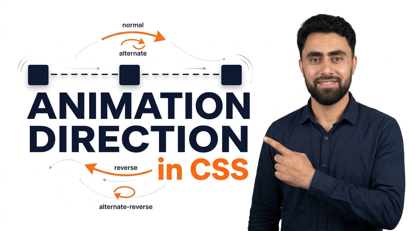
The best Animation Direction in CSS you have ever practice in this tutorial
Get the code of Animation Direction in CSS and watch video tutorials. You can practice using our code editor. Our practical guide will make your learning journey much easier. You can explore the tutorial and learn.
<div></div>div {
background: dodgerblue;
width: 50px;
height: 50px;
position: relative;
animation: ramzan 1s infinite;
animation-direction: alternate;
}
@keyframes ramzan {
from {left: 0px;}
to {left: 100px;}
}Animation Direction in CSS
CSS animations make websites more attractive by adding movement to elements such as buttons, images, icons, and backgrounds. One important property that helps control this movement is animation-direction. It determines whether an animation plays forward, backward, or alternates between both directions.
Understanding animation direction can help you create smoother effects without writing separate animations for every movement. Whether you are designing a simple button effect or a continuously moving element, this CSS property gives you greater control over how an animation behaves.
What Is Animation Direction in CSS?
The animation-direction property defines the direction in which an animation plays through its keyframes. Keyframes describe the different stages of an animation, including how an element looks at the beginning, middle, and end.
By default, an animation plays from its starting keyframe to its ending keyframe. However, you can change this behavior to make the animation run backward or switch directions after each iteration.
This property is especially useful for decorative effects, animated icons, loading indicators, and elements that move repeatedly on a webpage.
Different Values of Animation Direction
CSS supports four main values for the animation-direction property. Each one produces a different playback behavior.
1. Normal
The normal value plays the animation forward during every iteration. The animation follows the order in which its keyframes are defined, moving from the first keyframe toward the last.
This is the default value, so you do not need to specify it unless you want to make the animation behavior explicit.
It is useful for effects such as fading in a heading, moving an image across a section, or gradually changing an element’s appearance.
2. Reverse
The reverse value plays the animation backward. Instead of following the keyframes from beginning to end, the animation follows them in reverse order.
For example, if an animation normally moves an object from left to right, reversing it can make the object move from right to left, depending on how the keyframes are defined.
This value is helpful when you want the opposite effect without creating an entirely separate set of keyframes.
3. Alternate
The alternate value makes the animation switch direction between iterations. The first iteration plays forward, the second plays backward, and the pattern continues as long as the animation repeats.
This creates a natural back-and-forth effect. It is particularly useful for floating objects, bouncing elements, and decorative shapes that move repeatedly.
For this behavior to be visible, the animation needs multiple iterations. A single iteration cannot demonstrate the repeated direction change.
4. Alternate-Reverse
The alternate-reverse value also switches direction after each iteration, but it starts by playing the animation backward.
The first iteration runs in reverse, the second runs forward, and later iterations continue alternating between the two directions.
This option is useful when you want an animation to begin from its ending keyframe and then move back and forth.
How Animation Direction Works with Keyframes
The animation-direction property works together with the CSS @keyframes rule. Keyframes define the visual changes, while animation direction determines the order in which those changes are played.
For example, imagine an element that gradually moves from one side of a container to the other. With the normal value, it follows the defined movement. With reverse, it follows the same sequence backward. With alternate, it moves forward on one iteration and backward on the next.
The direction does not automatically create a new movement or change the keyframe values. It changes how the existing animation is played.
Common Uses of Animation Direction
Creating Floating Effects
The alternate value can make an element move between two positions repeatedly. When combined with carefully chosen keyframes, it can create a gentle floating effect for illustrations or decorative shapes.
Animating Website Icons
Icons can rotate, move, or change their appearance in repeated patterns. Animation direction helps control whether the effect repeats in the same direction or alternates between directions.
Designing Loading Indicators
Some loading animations use repeated movement to communicate that a process is still running. Choosing the right direction can make the movement look continuous and consistent.
Adding Motion to Background Elements
Decorative backgrounds sometimes include moving shapes or gradients. Alternating animations can create movement that feels less abrupt than repeatedly jumping back to the starting point.
Benefits of Animation Direction in CSS
One major benefit is that it reduces unnecessary duplication. Instead of creating separate keyframes for forward and backward movement, you can often reuse the same animation and control its direction through a single property.
It also makes CSS easier to maintain. Changing the animation direction is usually simpler than rewriting the entire animation sequence.
Another advantage is flexibility. By combining animation direction with duration, iteration count, and timing functions, you can create different effects from the same set of keyframes.
Common Mistakes to Avoid
One common mistake is expecting alternate to work as a back-and-forth animation when the animation only runs once. The direction changes between iterations, so repeated playback is necessary to see the alternating effect.
Another mistake is confusing animation direction with animation timing. Direction controls the order of keyframes, while timing controls how the animation progresses over time.
You should also avoid adding too much movement to a page. Excessive animation can distract visitors and make a website harder to use. Consider supporting the prefers-reduced-motion setting so visitors who prefer less movement can have a more comfortable experience.
Conclusion
Animation Direction in CSS is a simple but powerful property for controlling how animations play. Its four values—normal, reverse, alternate, and alternate-reverse—allow you to control forward, backward, and alternating movement.
By combining animation direction with keyframes and suitable timing, you can create smoother website effects while keeping your CSS organized. Use animations with a clear purpose, and focus on performance, accessibility, and a consistent design to create a better experience for your visitors.
Ready to become a better coder? Don’t miss this tutorial! Create a Basic HTML CSS Website Home Page
Pingback: Add Color Swatches in Shopify Product Pages? All Free Themes - Mr Digitals
Pingback: Add FREE order tracking page in Shopify store - Mr Digitals
Pingback: Add Marquee Effect In Shopify Announcement Bar? - Mr Digitals
Pingback: Before After Section in Shopify Store - Mr Digitals
Pingback: Block Vs Inline Block Element in HTML - Mr Digitals
Pingback: Block Vs Inline Element in HTML - Mr Digitals
Pingback: HTML input type radio button - Mr Digitals
Pingback: HTML id attribute - Mr Digitals
Pingback: HTML button click - Mr Digitals
Pingback: HTML structure - Mr Digitals
Pingback: HTML meta tags - Mr Digitals
Pingback: HTML picture tag - Mr Digitals
Pingback: HTML Fieldset - Mr Digitals
Pingback: HTML horizontal ruler - Mr Digitals
Pingback: HTML form disabled attribute - Mr Digitals
Pingback: HTML embed image - Mr Digitals
Pingback: HTML Video Embed Tag - Mr Digitals
Pingback: HTML form required attribute - Mr Digitals
Pingback: HTML form size attribute - Mr Digitals
Pingback: HTML form minlength attribute - Mr Digitals
Pingback: HTML bold tag - Mr Digitals
Pingback: HTML popover - Mr Digitals
Pingback: HTML textarea spellcheck - Mr Digitals